I do User Research and Experience Design to help organisations design clear, human-centred digital experiences that make complex things feel simple.
I see design as an ongoing conversation between people and systems - a way of translating needs, behaviours, and insights into experiences that feel natural and useful. My process is grounded in curiosity and collaboration: listening, mapping, testing, and shaping ideas into flows that work intuitively across devices.
I’ve worked on projects for universities, financial tools, and wellbeing platforms - designing everything from responsive websites to full digital products. I enjoy connecting research with design, helping teams bring clarity and empathy into the way they build and communicate online.
This portfolio is a snapshot of that work - projects that reflect what I value most in design: simplicity, insight, and honest connection.
University of Quensland
Responsive component system & navigation redesign for Drupal CMS
Pearson PACE
Collaborative UX design for a digital teaching and learning platform
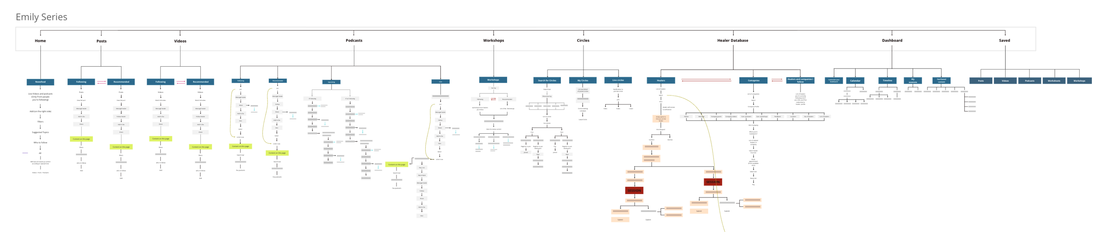
Enter Here
A digital bridge between healers and seekers of mental health support
Orbit Risk Exposure
Interaction design for a risk exposure platform used by hedge fund managers
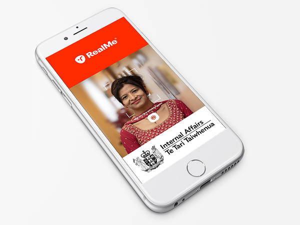
Government Visual ID
UX Research and Insights for NZ Department of Internal Affairs
Reserve Bank of Australia
Improving accessibility, usability & communication for the RBA
University of Queensland
A mobile-first design system enabling the University of Queensland to deliver a consistent, accessible experience across hundreds of Drupal-powered web pages
Problem Context
The University of Queensland engaged our team to improve the usability and consistency of its digital ecosystem, which spanned multiple faculties and services operating within a shared Drupal CMS.
Over time, content sprawl, inconsistent design components, and fragmented navigation patterns had made it difficult for users to locate information quickly — especially on mobile. The challenge was to design a responsive component system and interface paradigm that aligned with a new information architecture (IA), improved clarity and accessibility, and could be implemented seamlessly within the University’s existing Drupal framework.
Click image to open/close
Mobile page layouts for the Study section, showing component hierarchy, content structure and navigation within the Drupal CMS framework
Click image to open/close
Mobile wireframes illustrating the “Future Students” journey, mapping content and navigation pathways to the new information architecture
Process Workflow
Collaborating closely with the IA and development teams, I worked to map content types and templates against the new site architecture, identifying overlaps and inconsistencies across multiple content owners.
My process involved auditing existing Drupal components, rebuilding and consolidating them into a cohesive library, and prototyping new interface patterns for validation. We tested the navigation structure, page hierarchy, and responsive layouts through iterative wireframes to ensure that content remained readable and consistent across breakpoints.
This collaborative process bridged design and development, ensuring the new component system could be adopted easily by content editors within Drupal’s existing functionality.
Click image to open/close
Wireframes depicting the Search and Filter paradigms
Click image to open/close
A sample of the design guidlines for developers to implemment the CSS constraints for truncation behaviour in mobile view
Click image to open/close
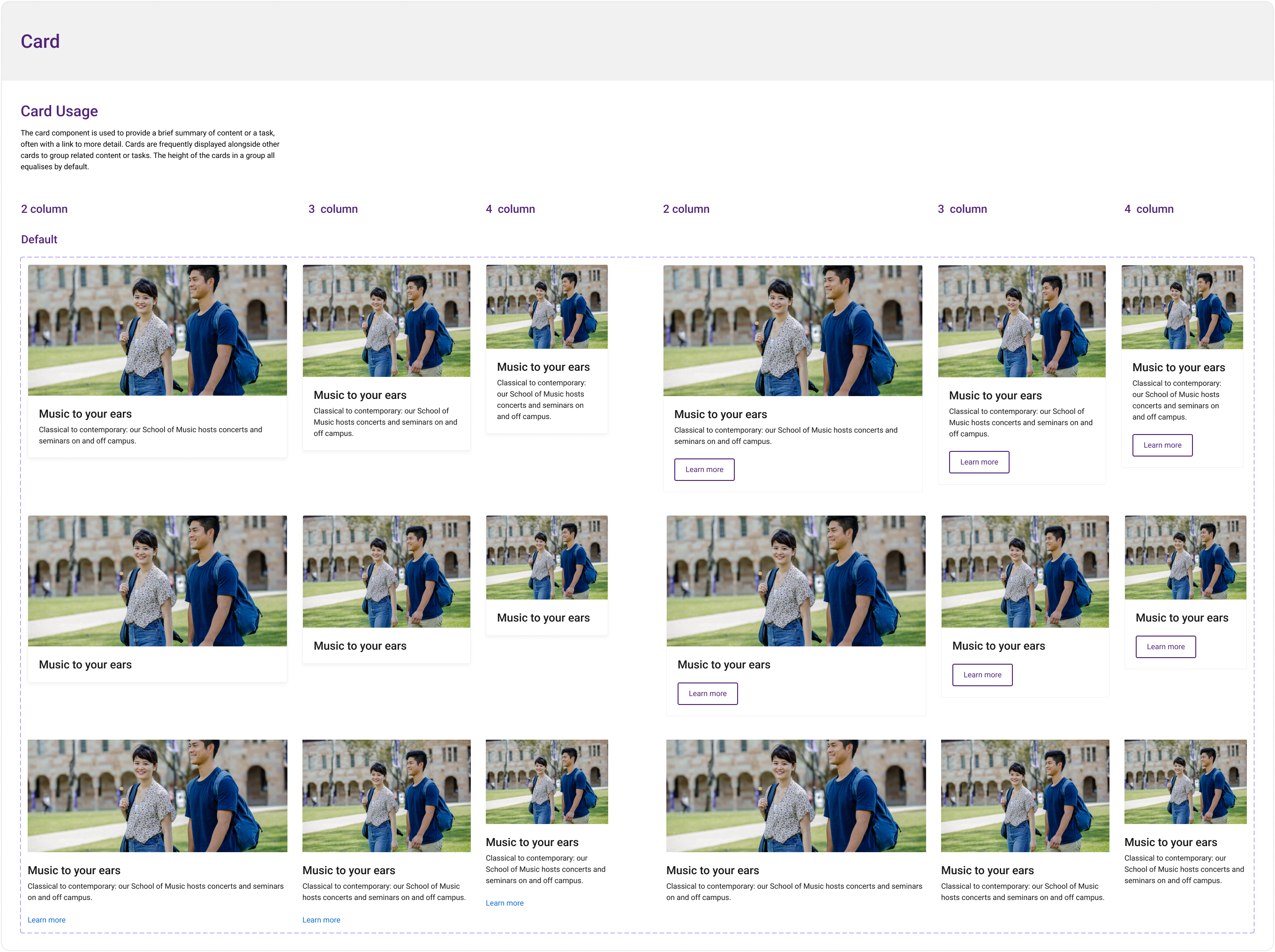
The anatomy of the Card component and it's variants across screen sizes
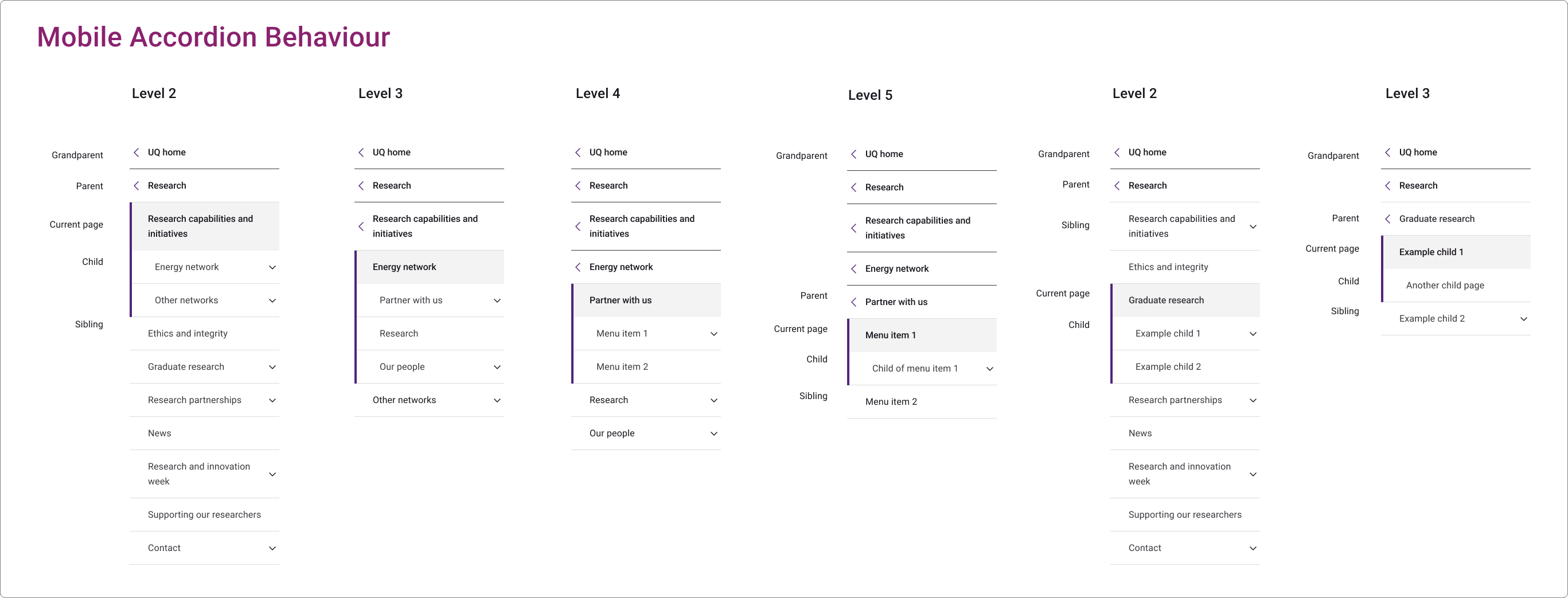
Mobile accordian navigation and menu item lineage structure
Final Design
The resulting design introduced a responsive, mobile-first component library optimised for clarity, flexibility, and accessibility. Each interface element — from navigation menus and search filters to content cards and image layouts — was rebuilt to maintain visual consistency and logical hierarchy across devices.
The modular design allowed editors to create rich, engaging pages without deviating from accessibility standards or brand guidelines. The improved content hierarchy prioritised key student journeys, including course discovery, enrolment, and campus life, while ensuring the system remained scalable for future updates.
Click image to open/close
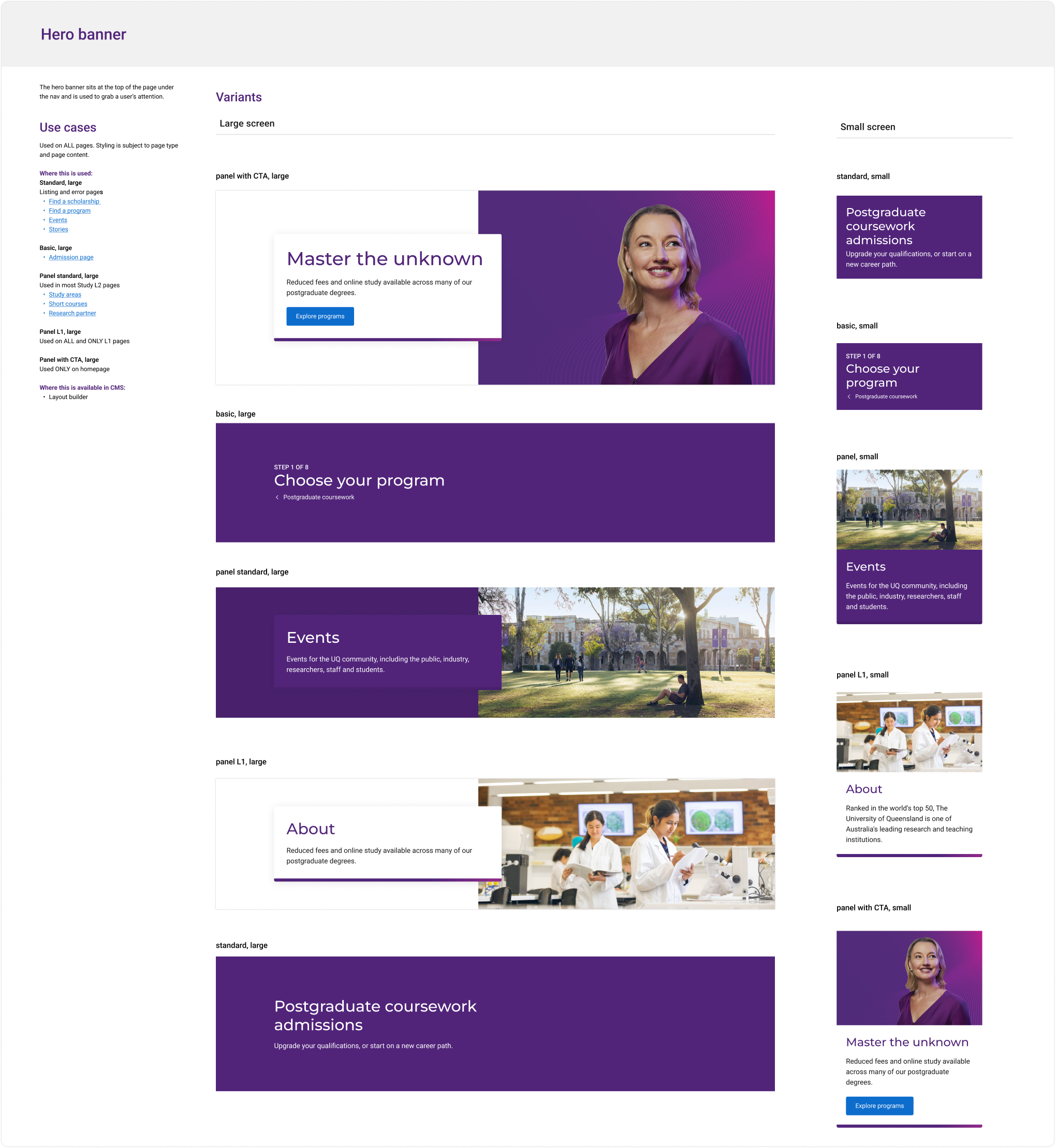
Example page from the component library use case guidelines for the Hero banner
Click image to open/close
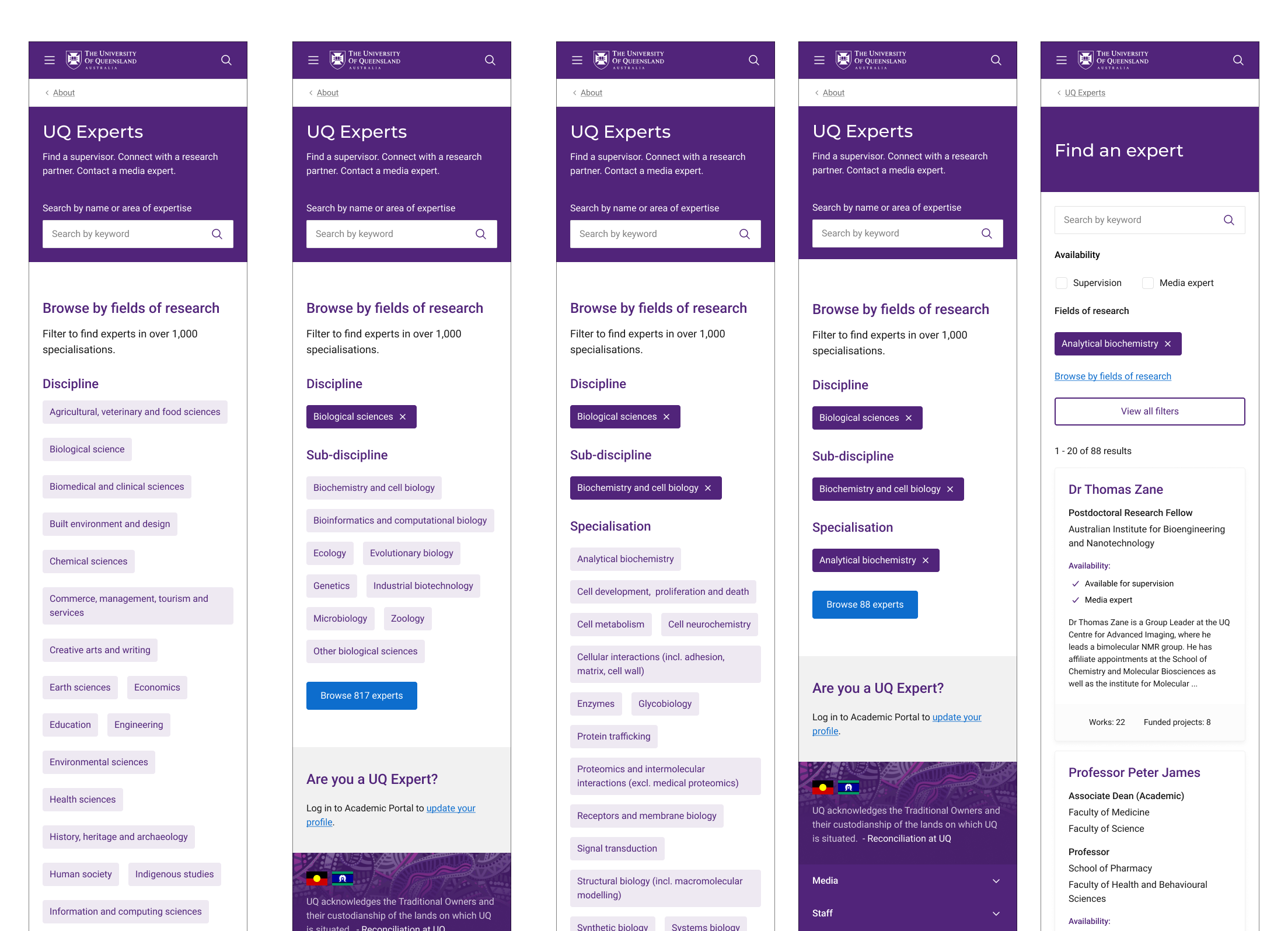
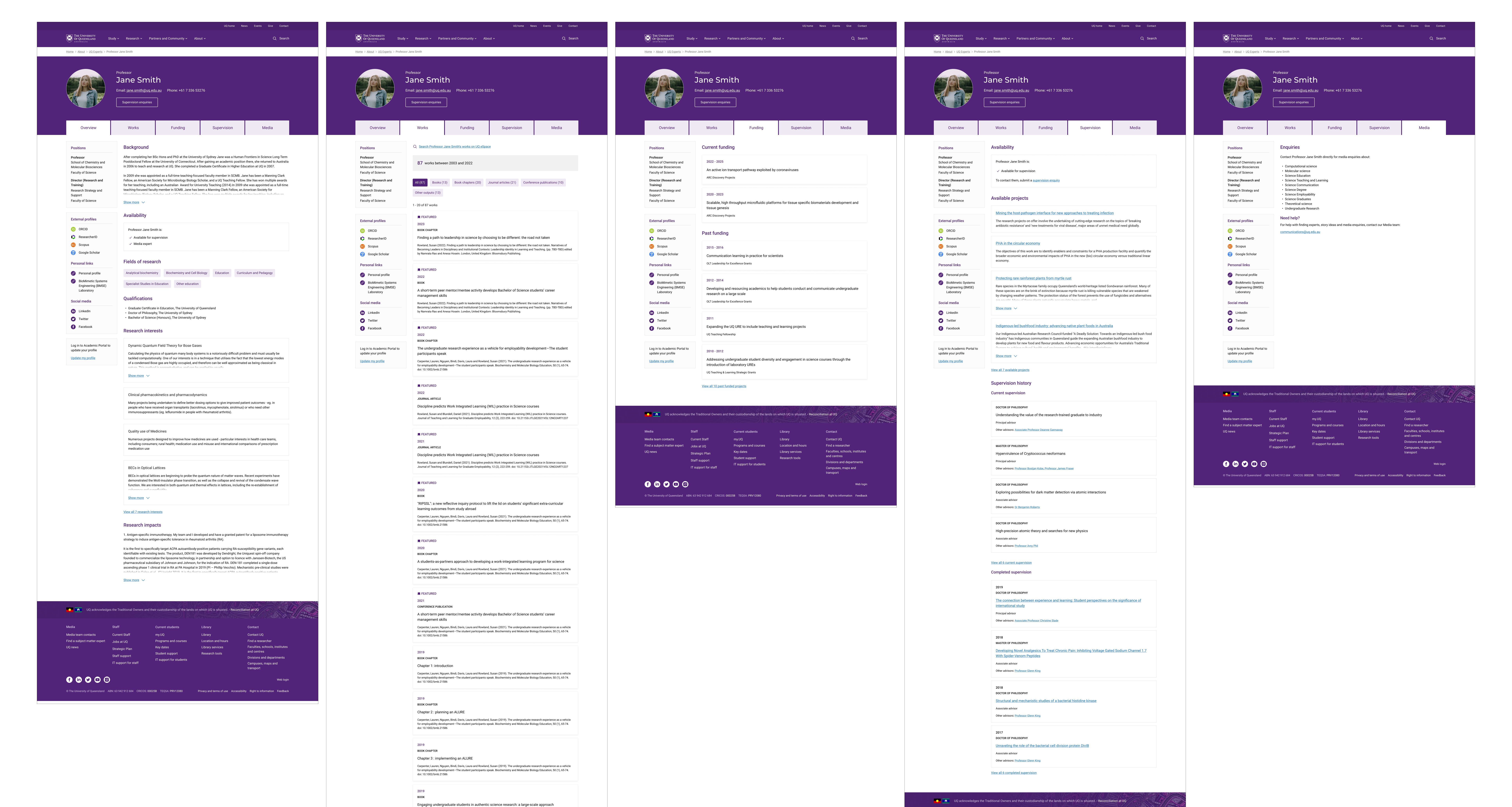
Browse, filter and refine functionality for UQ Experts field of research search
Click image to open/close
Profile page desktop
Click image to open/close
Profile page mobile
Impact
The design uplift created a more unified and accessible experience across the University’s digital ecosystem. By establishing a coherent component system and aligning it with the new IA, the project reduced redundancy, simplified content management, and improved navigation across devices.
Internal teams reported faster content updates, improved usability for mobile users, and greater flexibility within Drupal. For students and staff, the site became easier to navigate and more consistent, setting a foundation for the University’s ongoing digital transformation.
Pearson PACE
A content management and communication system for educators to streamline lesson creation and student engagement
Problem Context
Pearson PACE was designed to empower teachers and educational institutions to create, manage, and deliver lessons, assessments, and student communications in one cohesive platform.
The challenge was to unify a fragmented landscape of digital tools used by educators — lesson planning templates, assessment systems, and class communication channels — into a single, flexible interface.
My role as a UX designer was to collaborate across disciplines to understand how educators build and deliver learning experiences, identify usability barriers in existing systems, and design a content resource library that balanced academic rigour with intuitive usability.
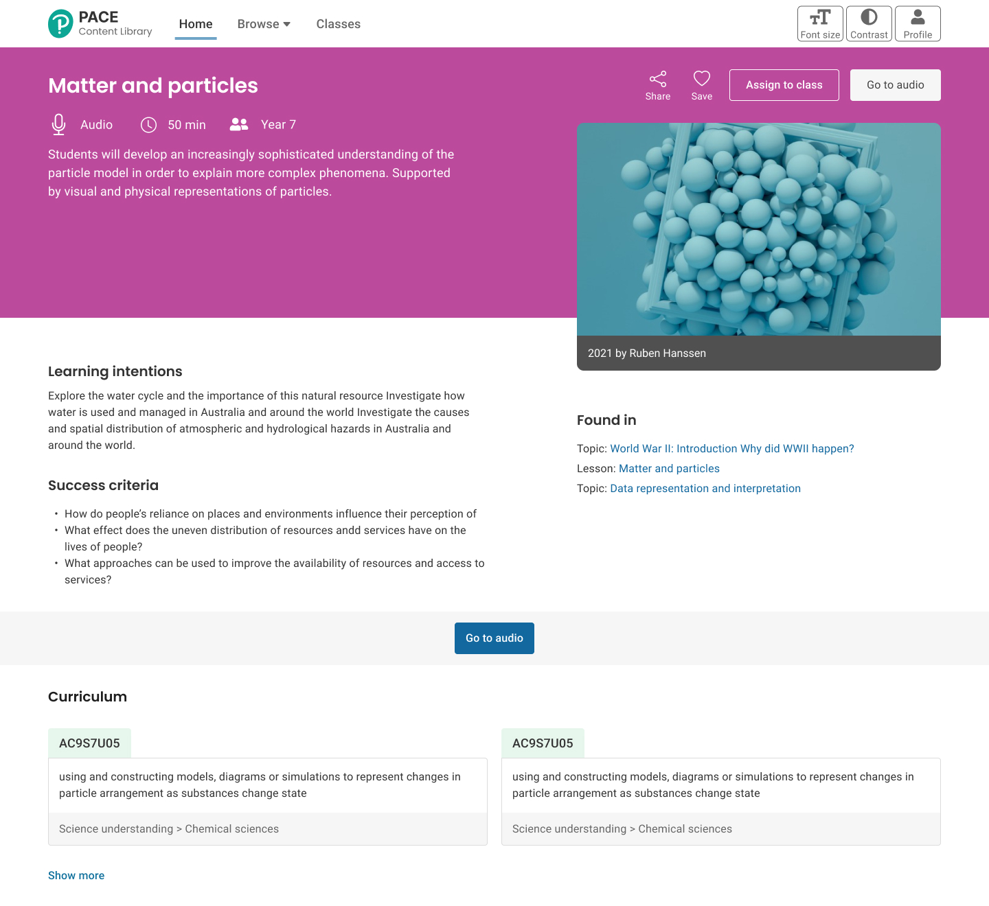
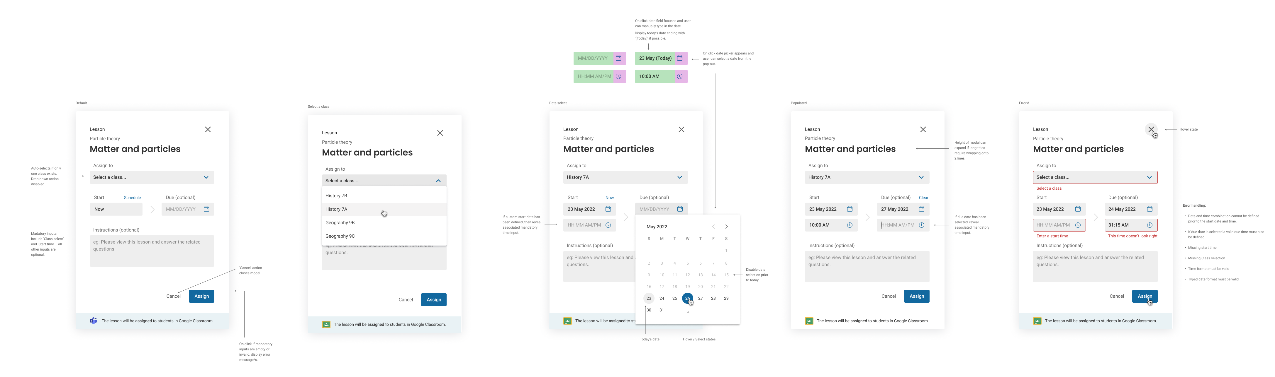
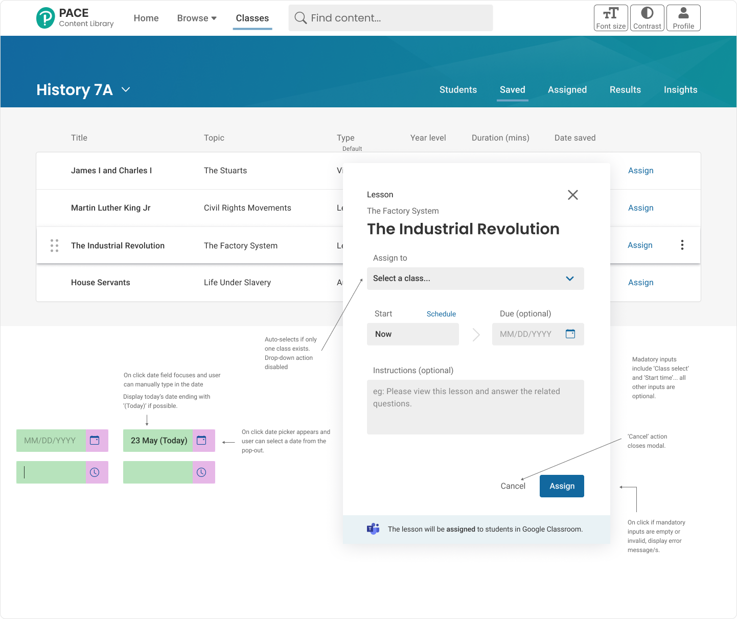
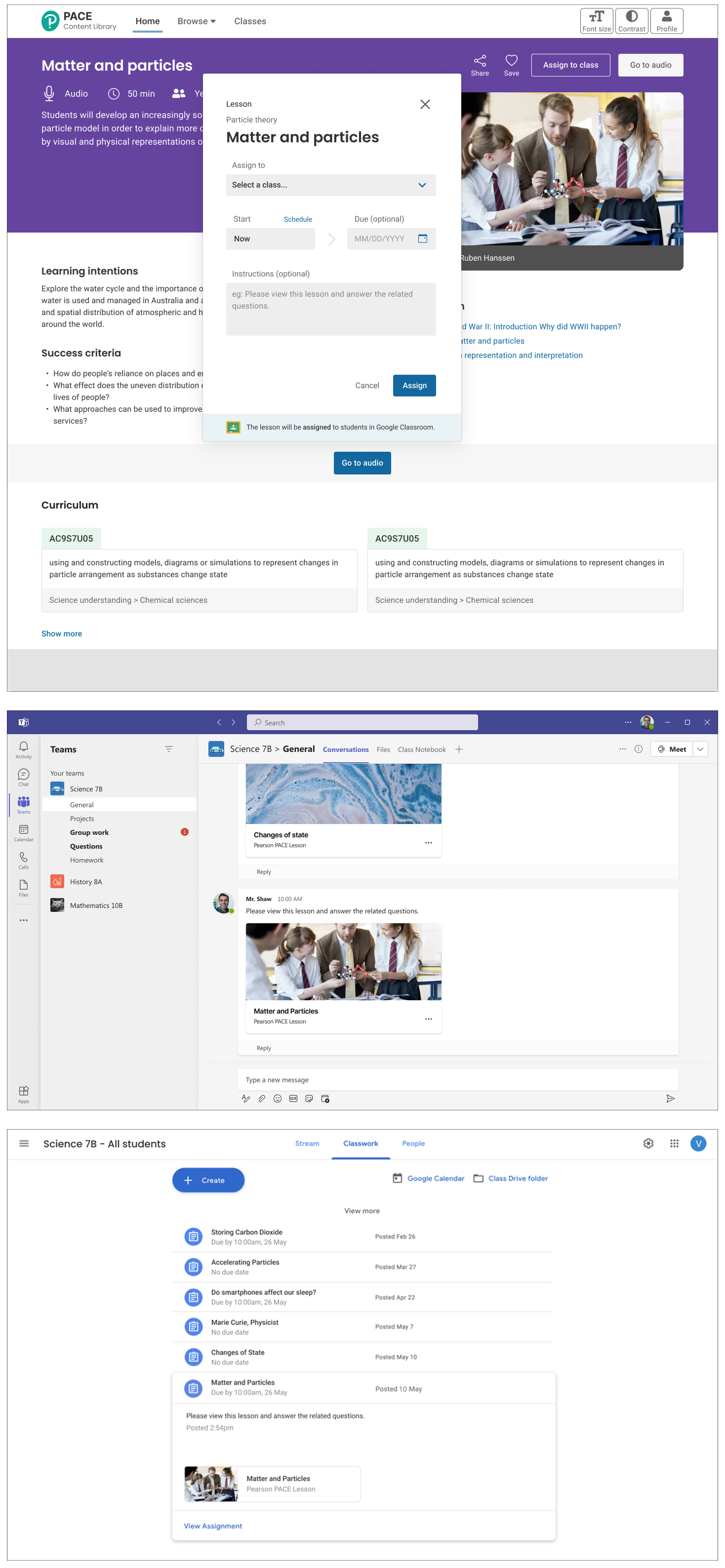
Click image to open
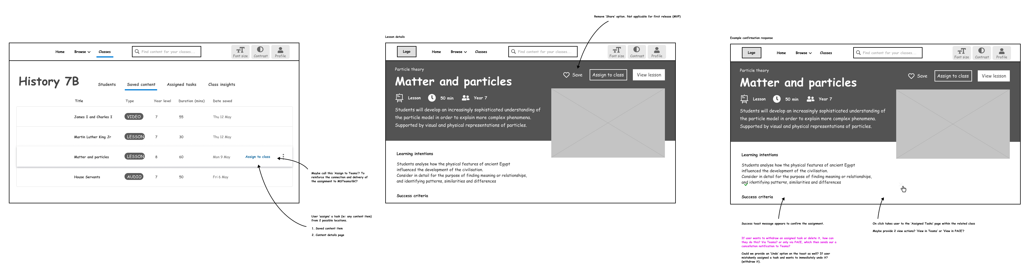
Audio content details page showing Australian cirriculum numbers and assign to class functionality
Process Workflow
Working alongside teachers, policy advisors, content strategists, and external developers, I led the process of mapping user journeys across the teaching lifecycle — from lesson creation and class management to grading and communication.
We ran co-design sessions with educators to surface pain points, developed interaction models for organising digital content, and tested prototypes that explored new approaches to tagging, filtering, and lesson assembly.
My focus was on translating the complexity of curriculum design into clear, user-centred workflows that simplified repetitive tasks, improved visibility of learning resources, and reduced friction between teaching and administrative responsibilities.
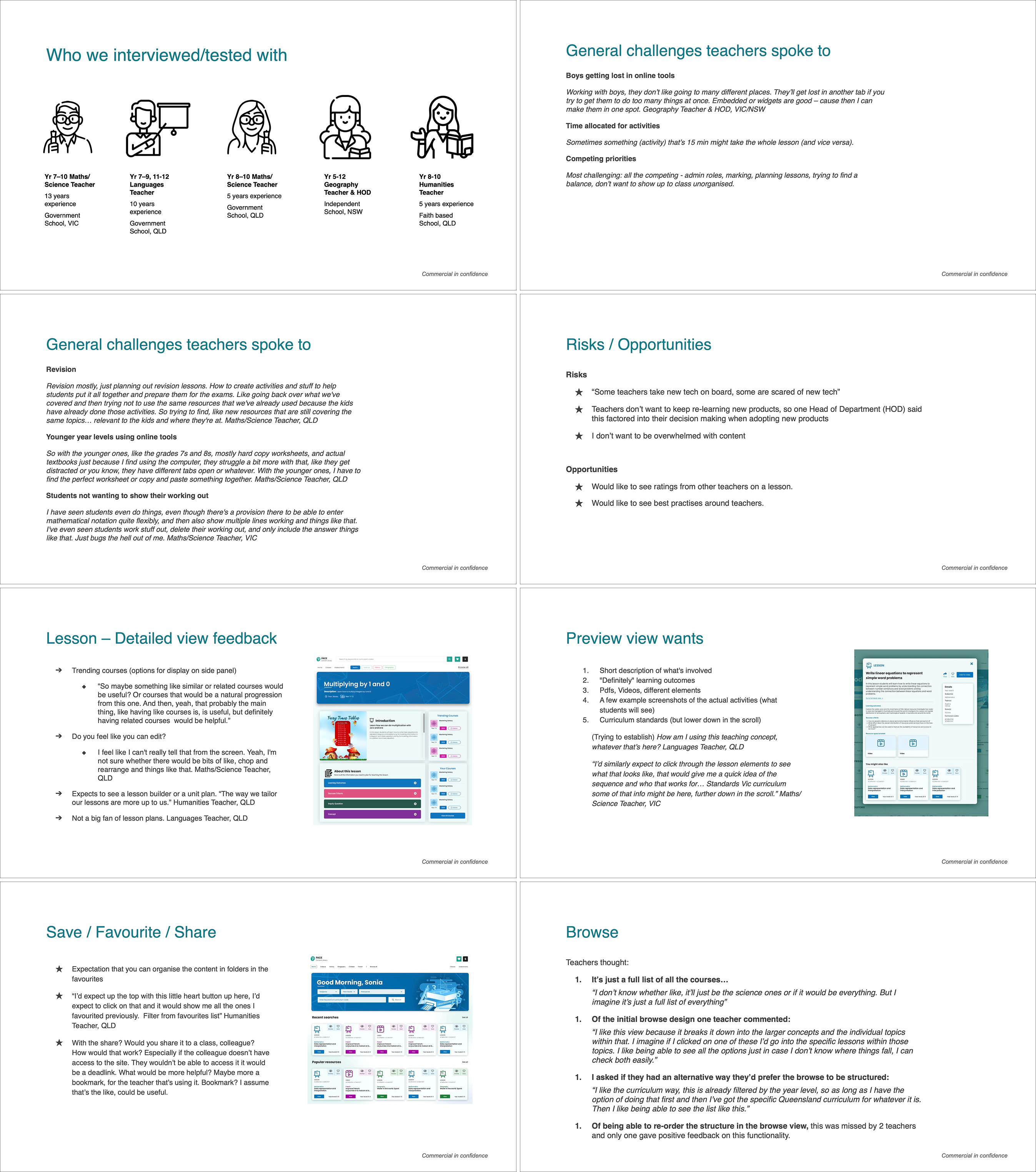
Click image to open
User research extracts from teacher interviews
Click image to open
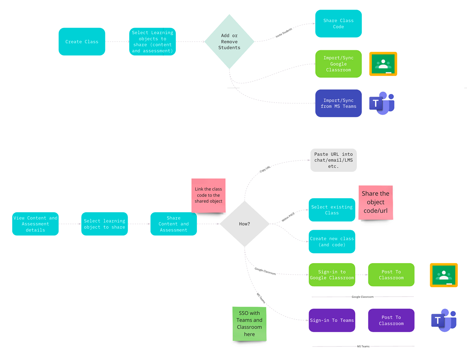
Teacher workflow intergrating Google Classroom or Microsoft Teams as the cloud-based virtual learning environment
Click image to open
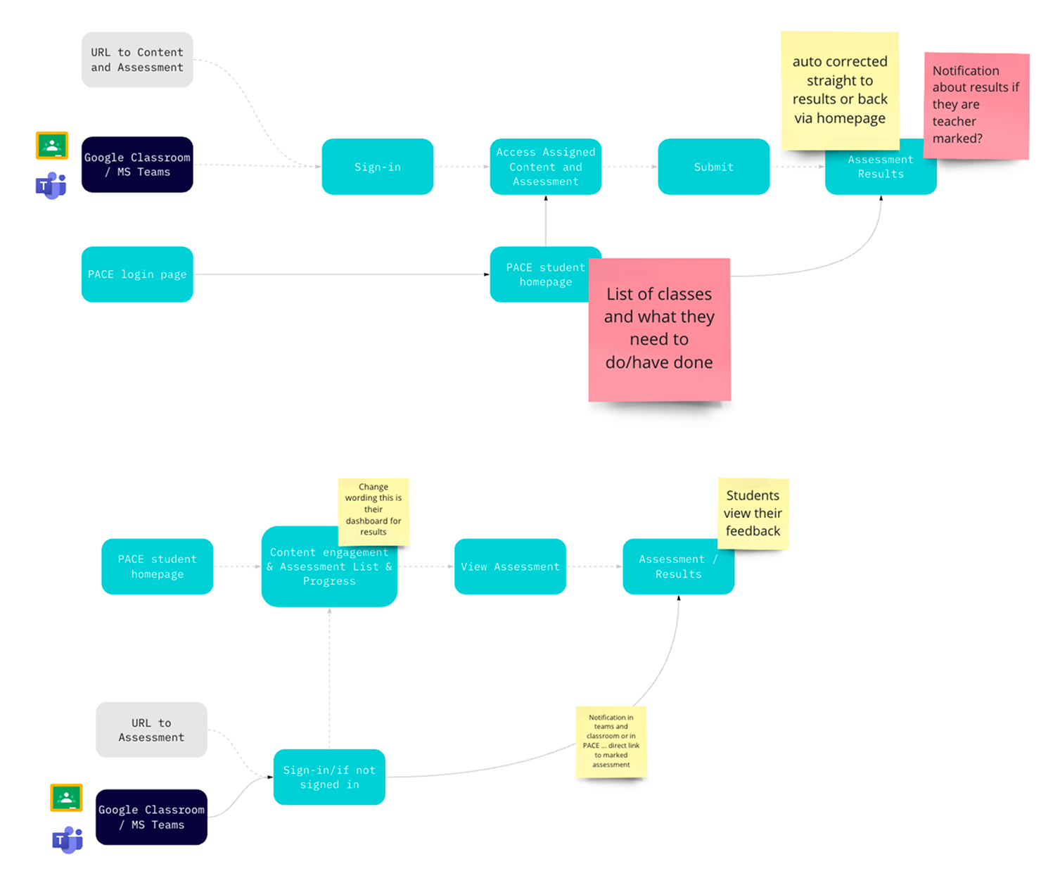
Student workflow from social platforms to submit course work and view assessment results
Early wireframes establishing assigning content to social platform functionality
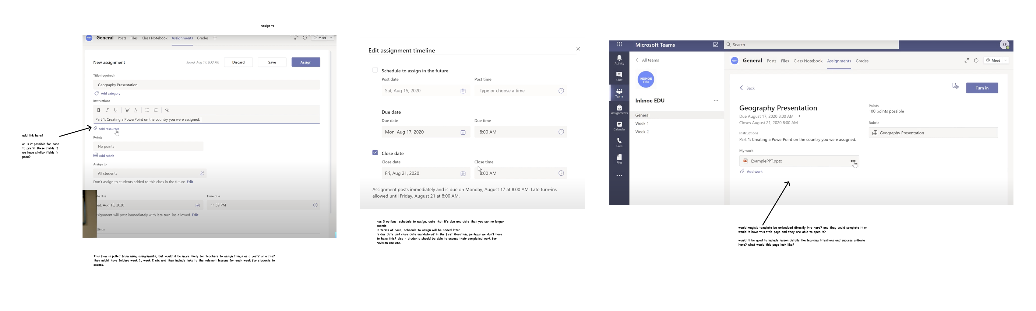
Microsoft Teams integration with assignment creation and student work submission
Final Design
The resulting design system featured a centralised content library where teachers could search, curate, and build lesson plans using modular resources aligned to curriculum standards.
Dynamic tagging and metadata allowed for flexible content organisation, while integrated communication tools and analytics supported student progress tracking and class management.
The interface balanced the needs of different user groups — teachers, administrators, and students — through role-based dashboards, making the platform both powerful and approachable across education levels.
Assigning surfaced content to a class with start date, due date and error messaging
Lesson details page and test screens showing integration with MS Teams and Google Classroom
Impact
The Pearson PACE platform demonstrated how human-centred design can simplify educational technology without sacrificing depth or flexibility.
Through collaborative design and validation, the project delivered a product that helped educators save time, personalise lessons, and gain clearer insights into student progress.
The research and design approach set a new benchmark for usability within Pearson’s digital products, and the modular structure enabled scalable adoption across schools, universities, and training providers.
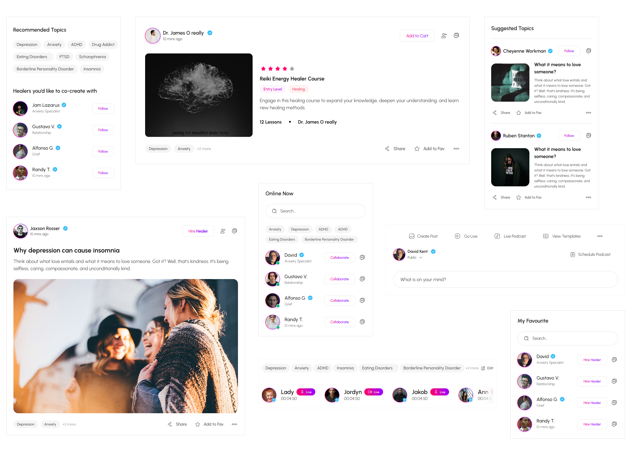
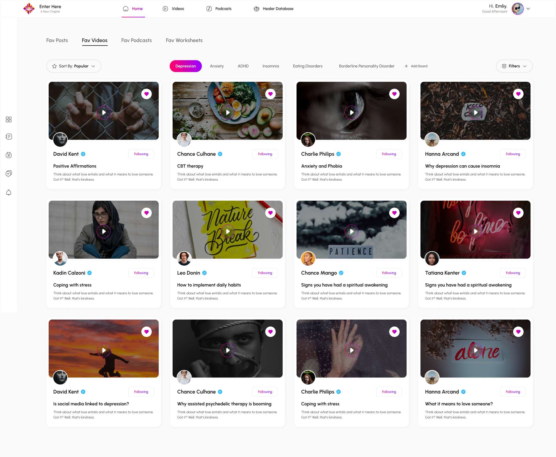
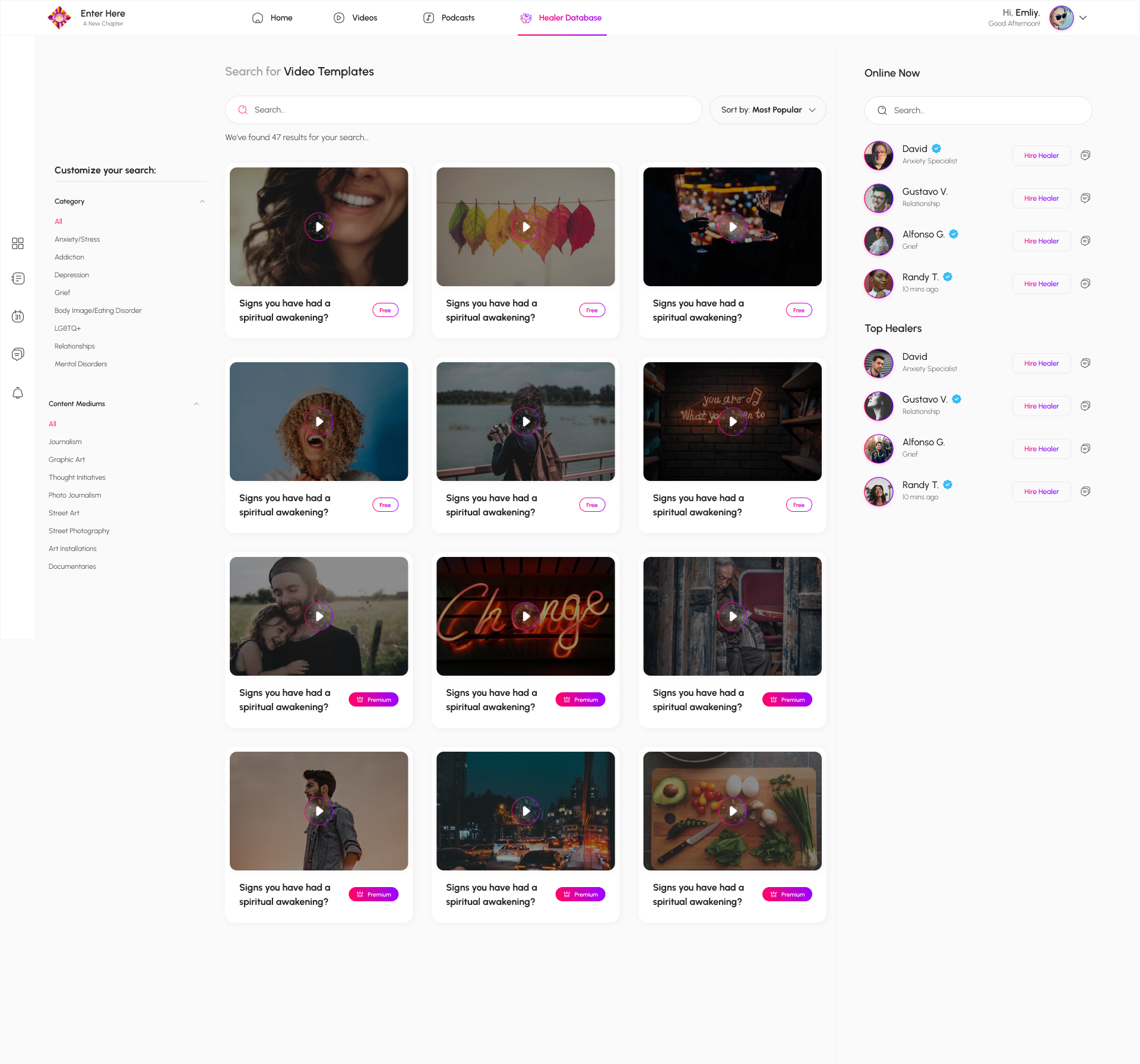
Enter Here
A passion project created to connect people seeking mental health support with trusted practitioners
Problem Context
The platform was created to make mental-health support more accessible by connecting individuals in need of help with verified practitioners and healers across a range of disciplines.
Its goal was to reduce the barriers to finding the right kind of support—matching seekers with professionals whose approach and values align with their needs.
As the lead UX designer, I collaborated with an industry expert, content strategist, and project manager to define the product vision, map user journeys for both practitioners and clients, and design a responsive interface that built trust through clarity, empathy, and privacy.
My work included developing the site’s information architecture, designing practitioner profile and booking flows, and establishing interaction patterns that support genuine human connection in a digital context. The result was two parallel experiences for distinct user groups within one coherent platform.
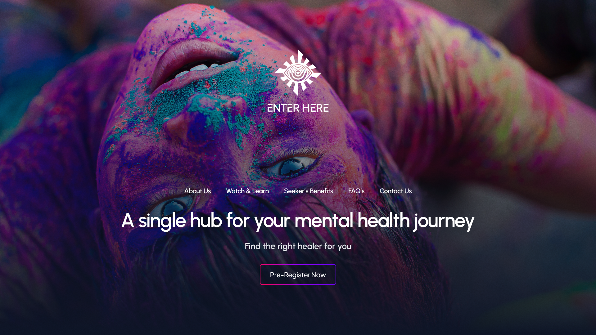
Hero banner for seeker landing page. The platform’s architecture supports two complementary portals — helping seekers access guidance and assisting practitioners to manage profiles, bookings, and communication tools within a shared design system.
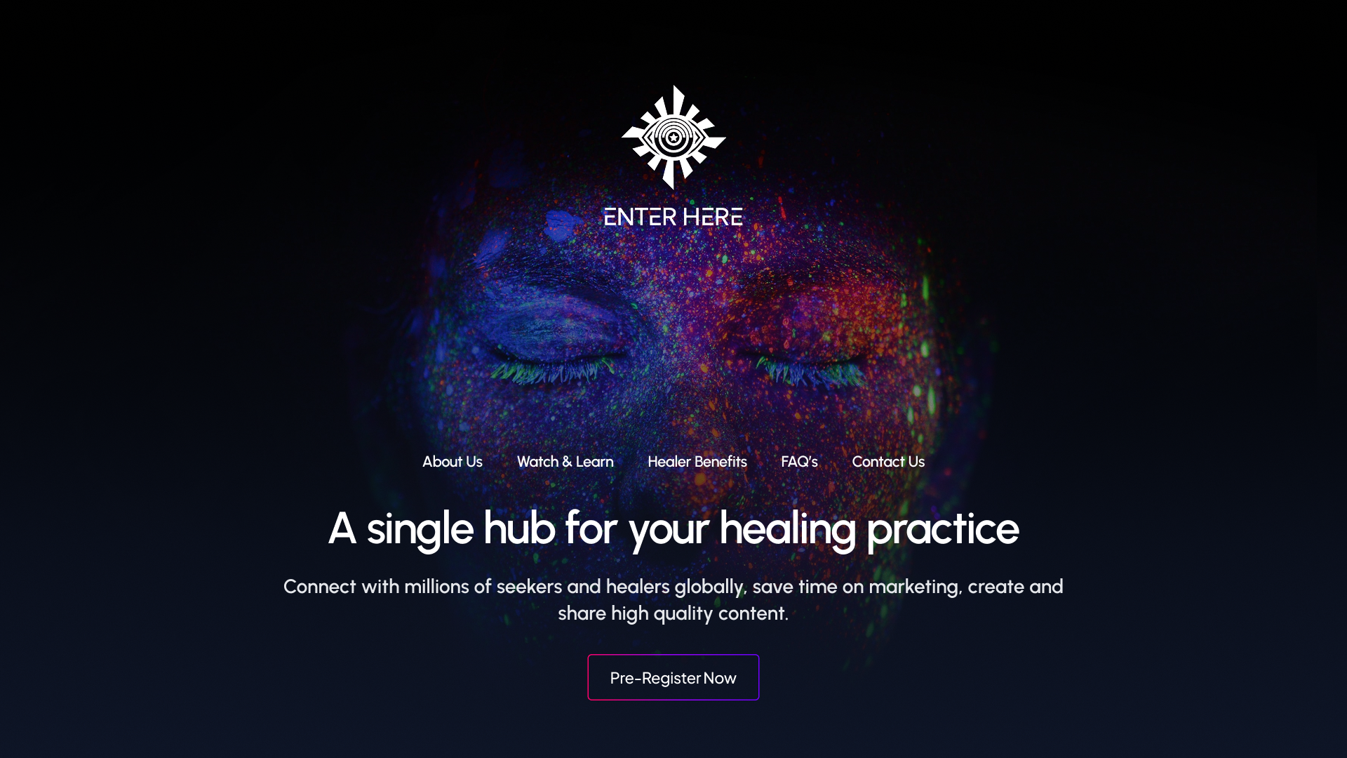
Landing page banner for the practicioner portal
Process Workflow
To bring the platform to life, I worked closely with the project manager, an industry expert, and a content strategist to shape the product from the ground up. Through collaborative workshops, competitor analysis, and iterative wireframing, we defined the dual-experience model that serves both Seekers and Practitioners. I mapped end-to-end user journeys, designed task-specific flows for booking, messaging, content discovery, and practitioner management, and validated the structure through continuous feedback loops with the team. This process ensured that every interaction supported emotional clarity, reduced friction, and aligned with the therapeutic tone at the heart of the platform.
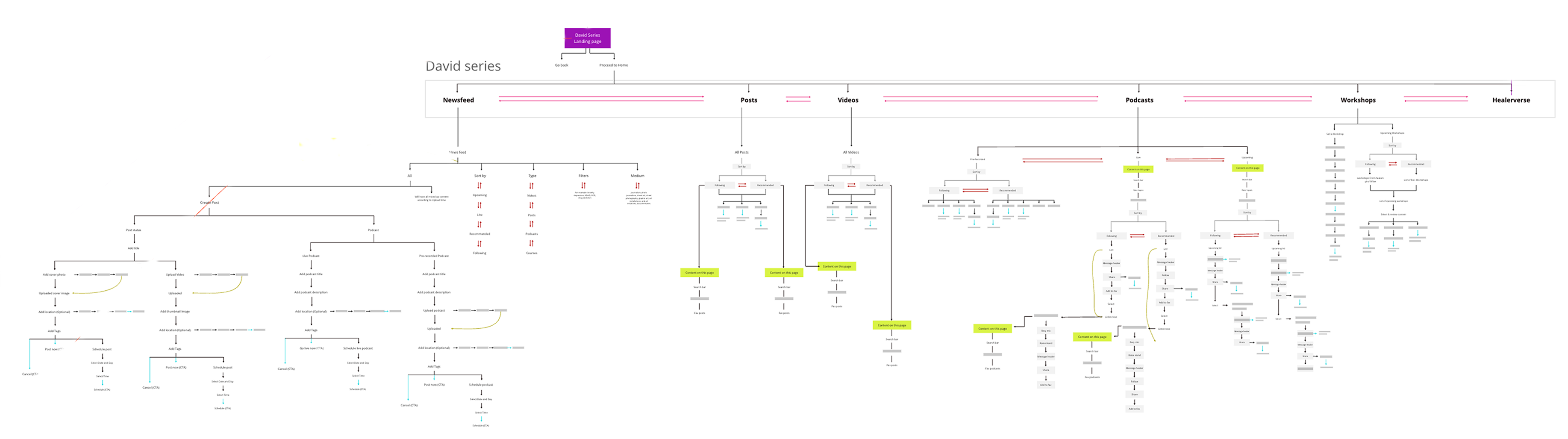
Information architecture for the practitioner portal
Information architecture for the seeker portal
Final Design
The final design delivers a calm, intuitive experience built around two clear paths: Seekers and Practitioners. Seekers get simple, supportive flows for finding help, exploring content, tracking mood, and managing sessions. Practitioners get structured tools for scheduling, earnings, analytics, and client communication. A clean visual system and strong hierarchy keep everything accessible, trustworthy, and easy to navigate.
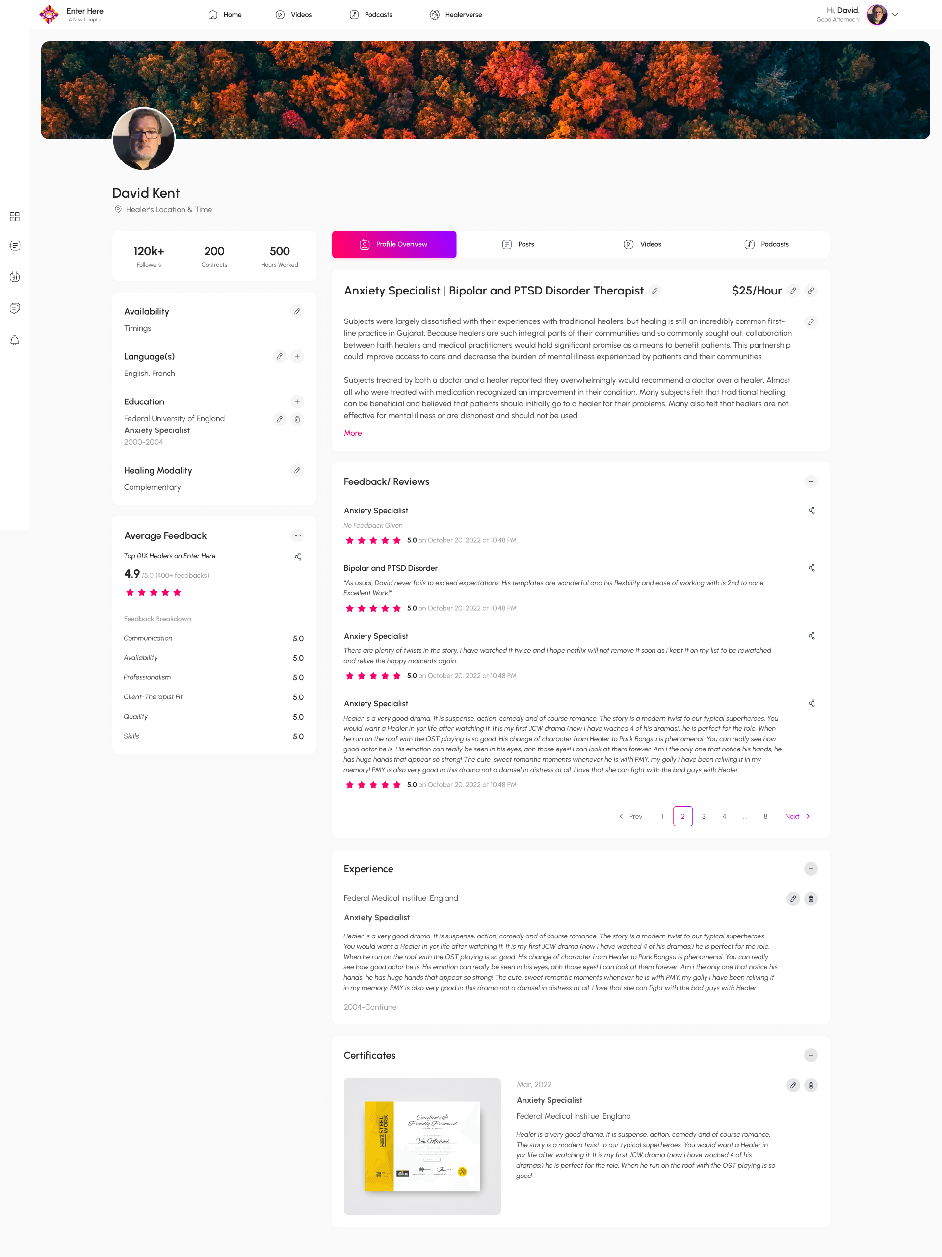
Click image to open
Practitioner profile page design featuring posts, videos, podcasts, and client feedback — created to build credibility and foster trust between practitioners and seekers. This page shows attention to content hierarchy, trust signals, and user motivation.
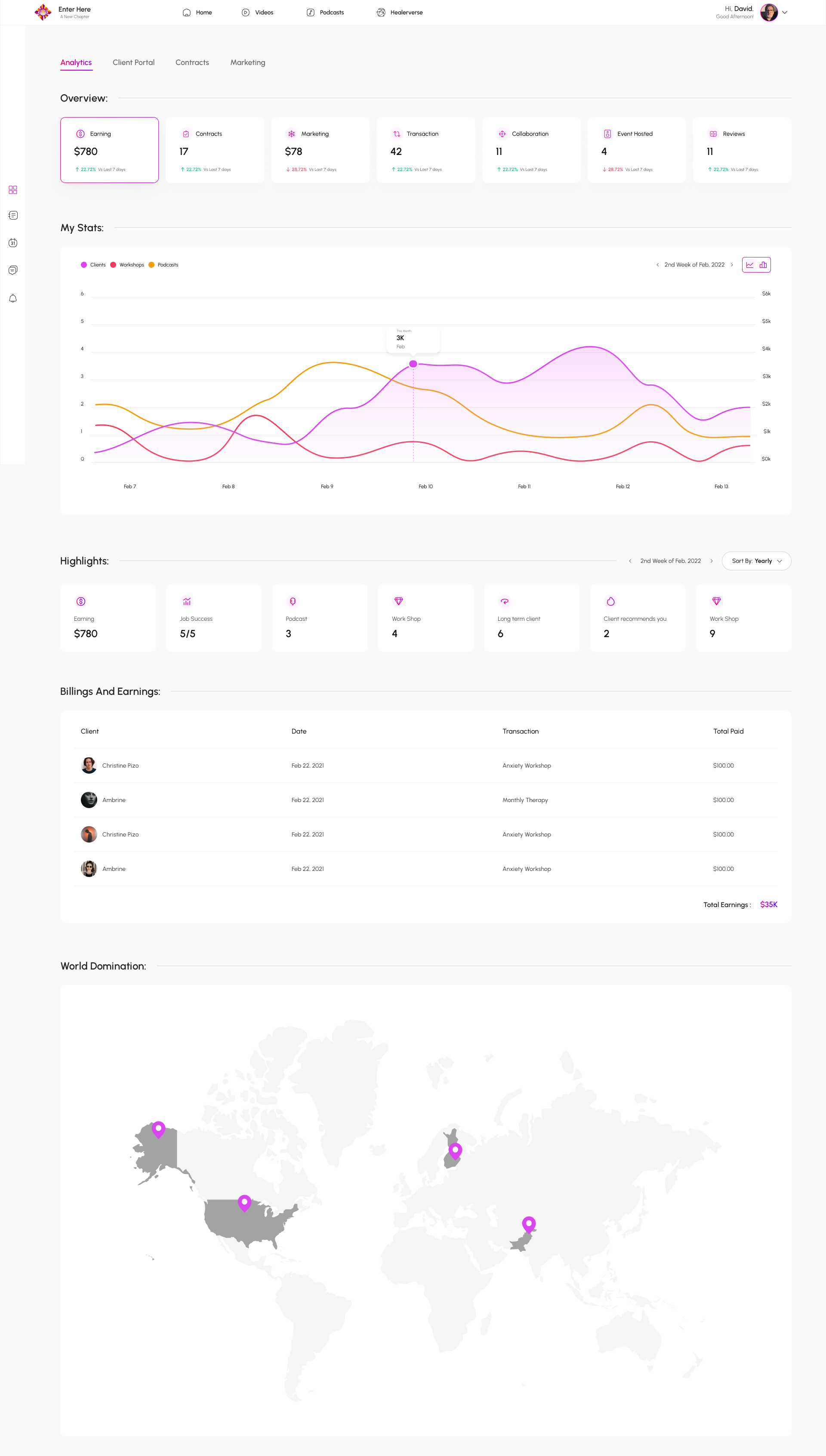
Click image to open
Practitioner analytics dashboard displaying earnings, client activity, hosted events, and reviews — designed to give healers clear insight into their performance and engagement within the platform.
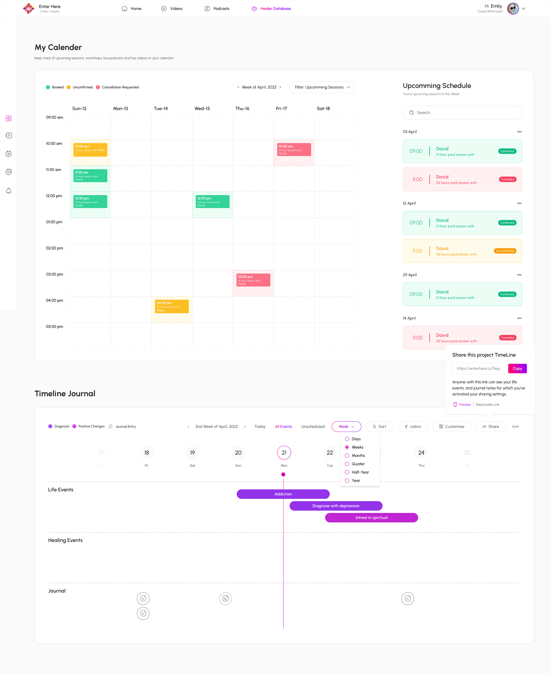
Click image to open
Seeker dashboard featuring a personal calendar and reflective journal timeline — designed to help users track sessions, goals, and emotional progress over time, encouraging reflection, continuity, and agency.
Click image to open
Modals and design components
Click image to open
Video library interface for seekers, presenting curated content tagged by topics such as depression and anxiety to support self-guided learning and emotional wellbeing - crucial for information-rich experiences that combine content taxonomy and discoverability.
Impact
The redesigned platform removed complexity, improved clarity, and built trust for both user groups. Seekers onboard more confidently, practitioners manage work more efficiently, and the platform now supports scalable future growth — from new content to expanded practitioner services.
Click image to open
Healer database search results
Click image to open
Landing page content for practitioners
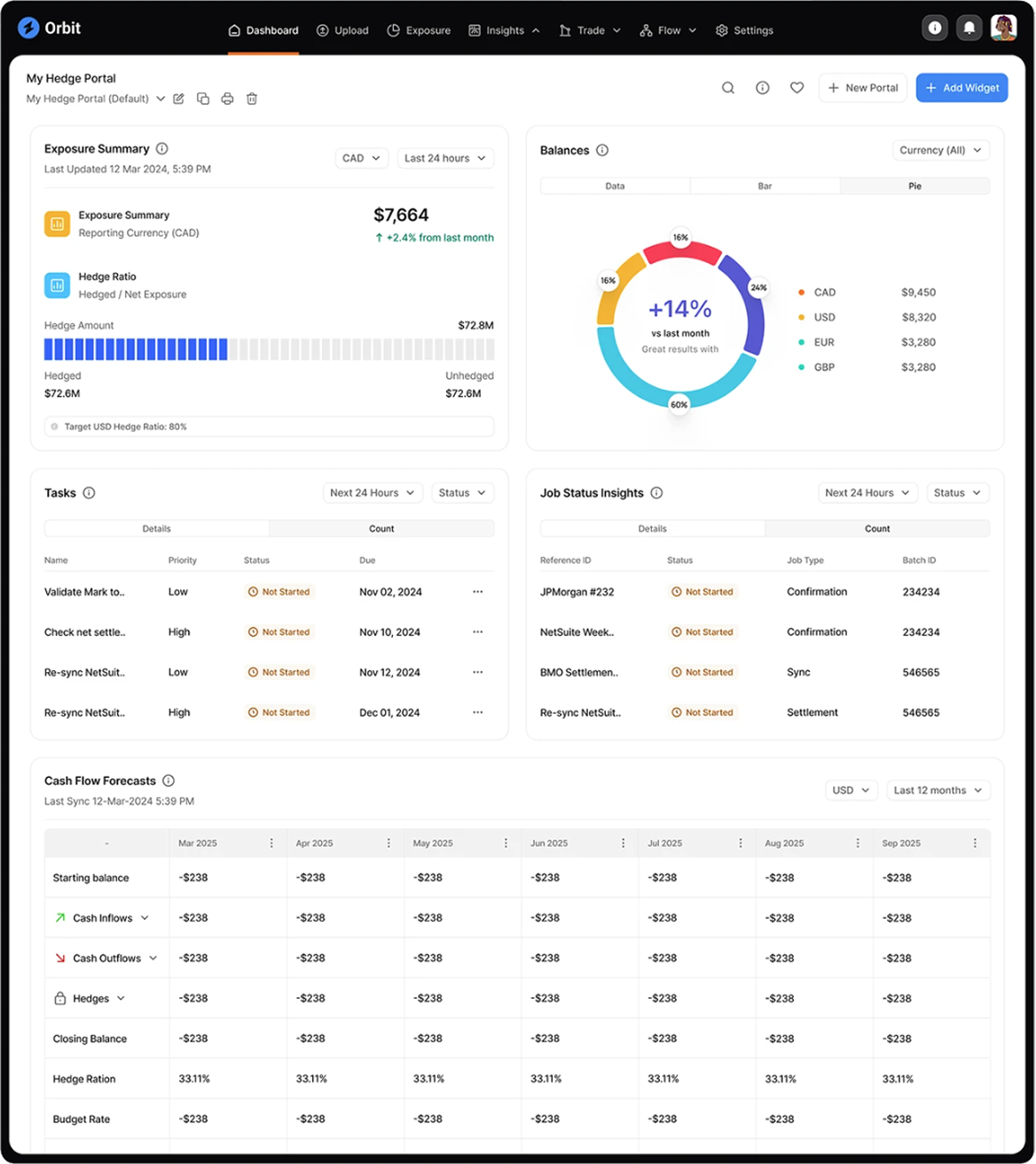
Orbit Risk Exposure Platform
Interaction design for a risk exposure platform used by hedge fund managers
Problem Context
Hedge fund managers needed a more efficient way to monitor risk exposure and portfolio performance across multiple data sources. Existing tools presented information in fragmented dashboards that required manual reconciliation and interpretation. The challenge was to design an interface that brought together exposure data, cash positions, and task insights into a single, intuitive system—reducing cognitive load and supporting confident decision-making in fast-moving market conditions.
Click image to open/close
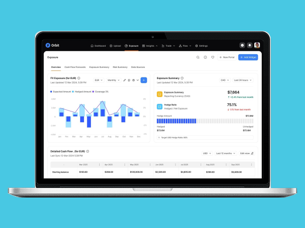
Dashboard view of the Hedge Portal showing exposure summary, hedge ratios, balances, task status, and cash-flow forecasts — designed to give fund managers an at-a-glance understanding of portfolio risk and performance.
Process Workflow
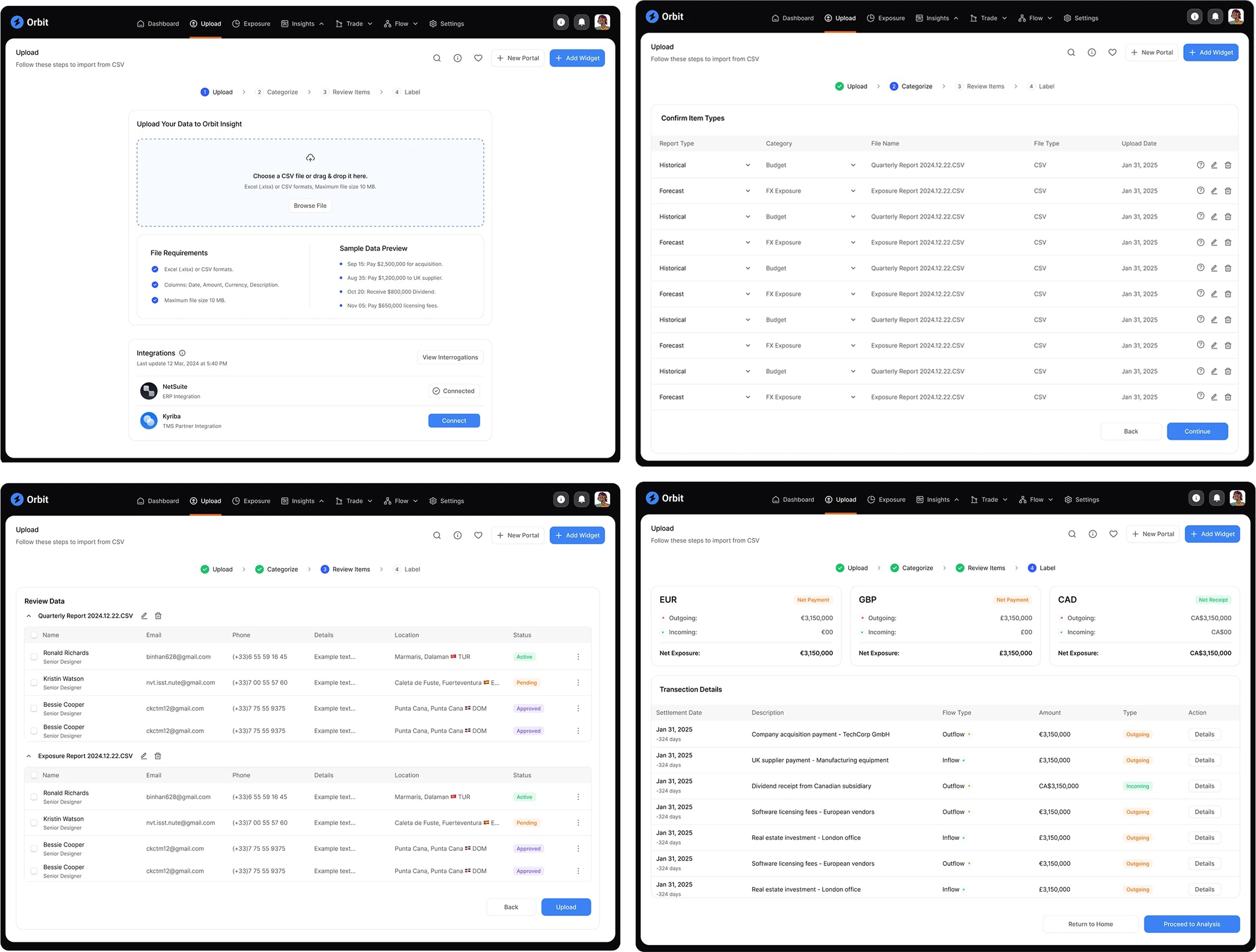
To make Orbit’s data-heavy workflows usable and intuitive, I began by analysing how hedge fund managers and analysts interacted with risk exposure data in their existing tools. The process was complex, repetitive, and error-prone. I collaborated with the product owner and engineering team to redesign this workflow into four clear stages: upload, categorise, review, and label.
I created wireframes and prototypes to test data hierarchy, visual grouping, and interaction flow. User feedback guided refinements that simplified navigation and improved data validation accuracy. The result was a streamlined process that transformed an intricate, technical task into an intuitive, guided experience.
Click image to open/close
Initial upload interface allowing users to import financial data via CSV. Designed for clarity and error prevention, guiding fund managers through a structured file submission process.
Final Design
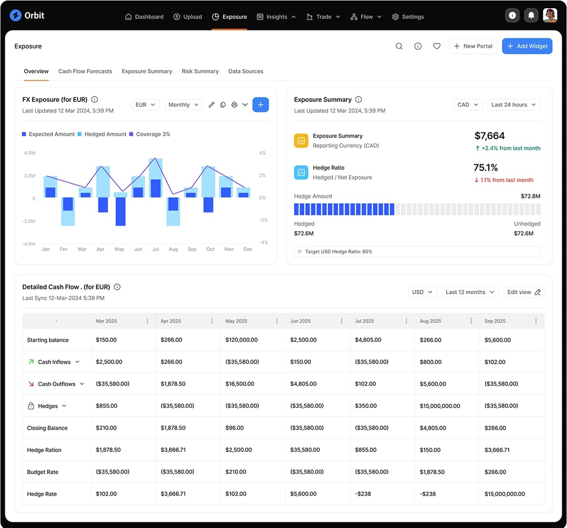
The final Orbit interface delivered a cohesive, data-driven environment where hedge fund managers could view exposure, balances, and cash flow forecasts in a single, responsive dashboard. The design system unified over twenty interaction components, ensuring consistency across complex analytical workflows.
Each screen was optimised for clarity and responsiveness, balancing depth of data with visual simplicity. Key user flows—such as file upload, validation, and analysis—were transformed into guided steps with clear progress indicators and feedback states. This design reduced the time spent navigating between tools and allowed portfolio managers to focus on interpreting insights rather than managing data.
Click image to open/close
Exposure dashboard visualising FX exposure across multiple currencies, hedge ratios, and detailed cash-flow positions. Designed to give fund managers a clear, real-time view of portfolio risk and performance within a single, interactive workspace.
Click image to open/close
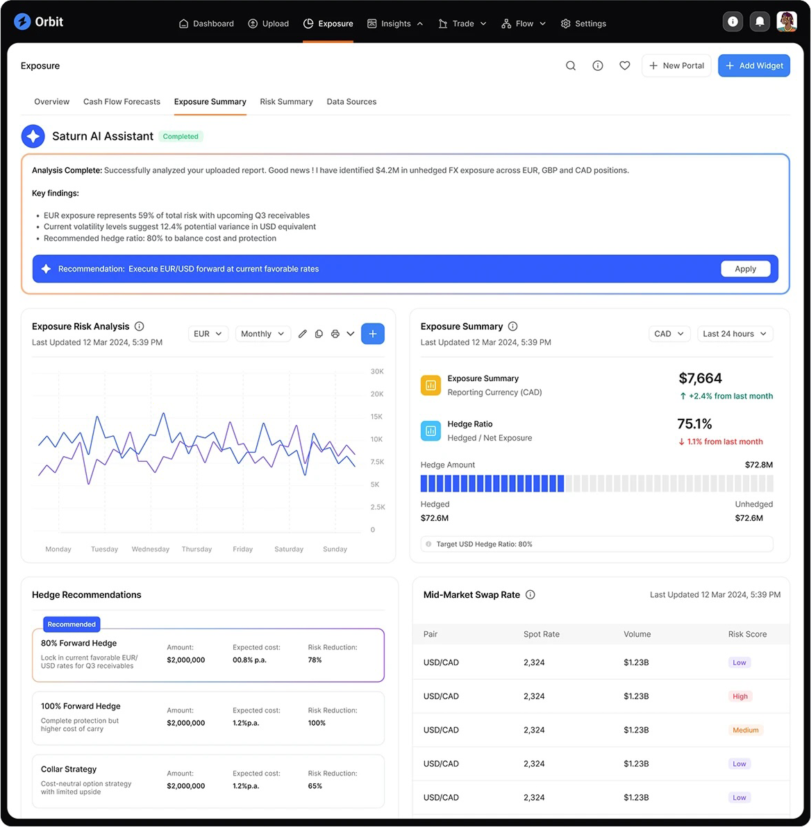
Exposure Summary tab presenting Saturn AI Assistant’s key findings, including exposure risk analysis, hedge ratios, recommendations, and mid-market swap rates. Designed to translate complex financial data into clear, actionable insights for portfolio managers.
Click image to open/close
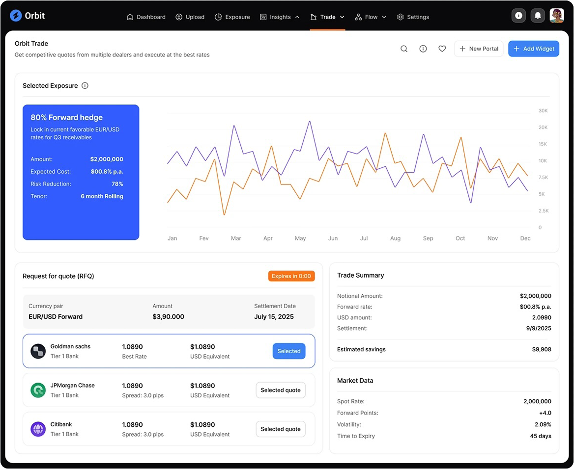
Trade interface enabling fund managers to request and compare quotes, review trade history, and view market movements in real time. The interaction design supports rapid evaluation and confident execution of complex financial transactions.
Impact
The redesign reduced the number of steps required to upload and analyse data by more than half, while improving user confidence in the accuracy of results. Fund managers reported clearer visibility across exposure categories and faster turnaround for reporting and decision-making.
By grounding every interaction in user workflow research, the final product delivered measurable gains in efficiency and clarity—transforming a complex, error-prone process into an intuitive analytical experience.
Click image to open/close
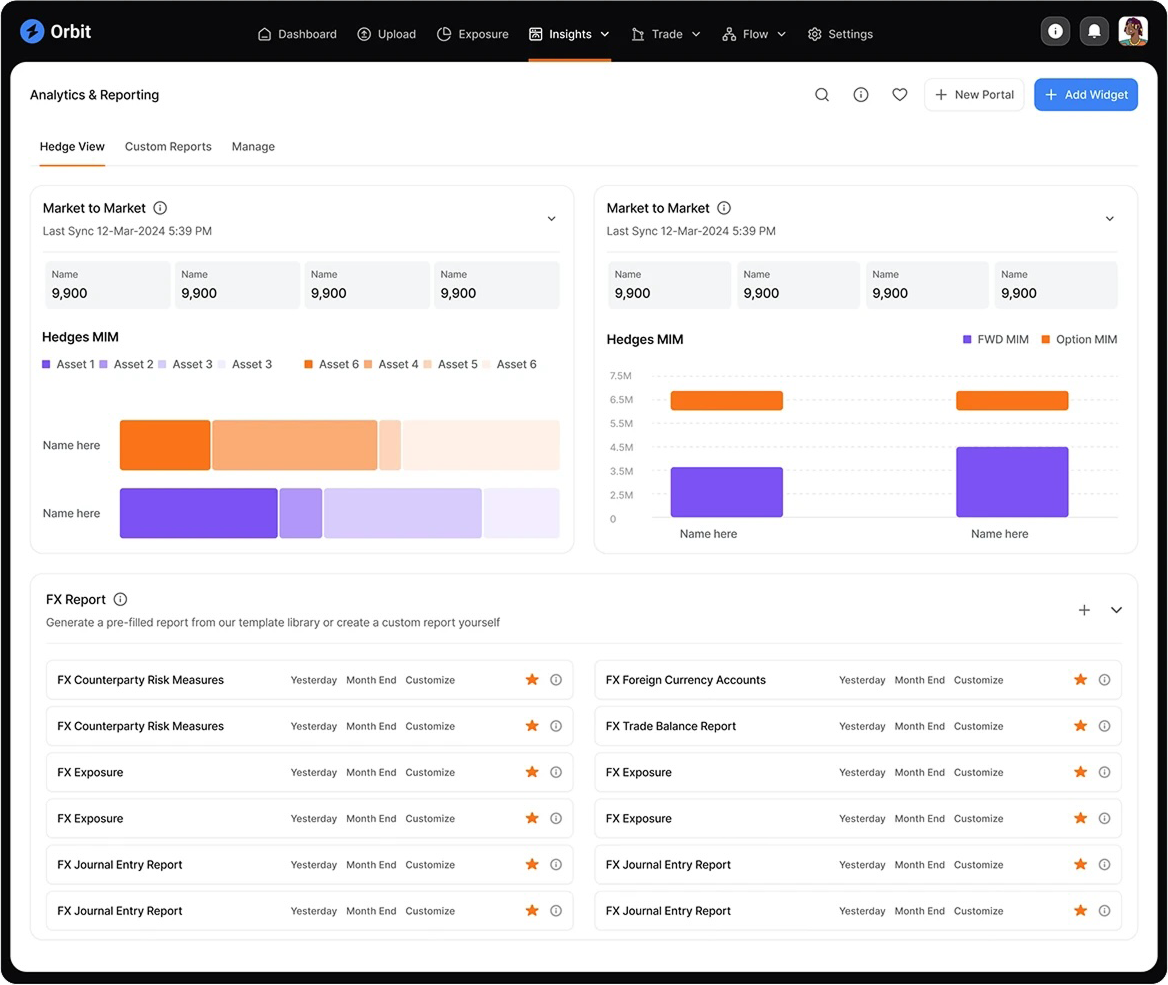
Analytics and Reporting page displaying hedge views of mark-to-market rates and relative asset values. Designed to give fund managers a clear comparative perspective on portfolio performance and hedge effectiveness through dynamic data visualisation
Click image to open/close
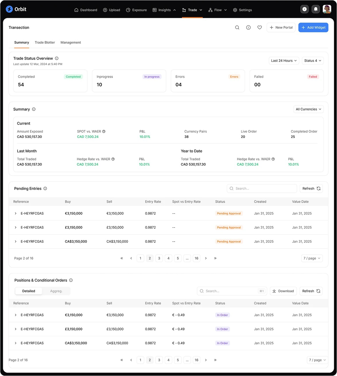
Overview screen consolidating trade status, pending entries, and conditional orders into a unified view. Clear hierarchy and responsive layouts support fast monitoring and decision-making in dynamic trading environments.
Department of Internal Affairs
Government Identify Verification Mobile App
Problem Context
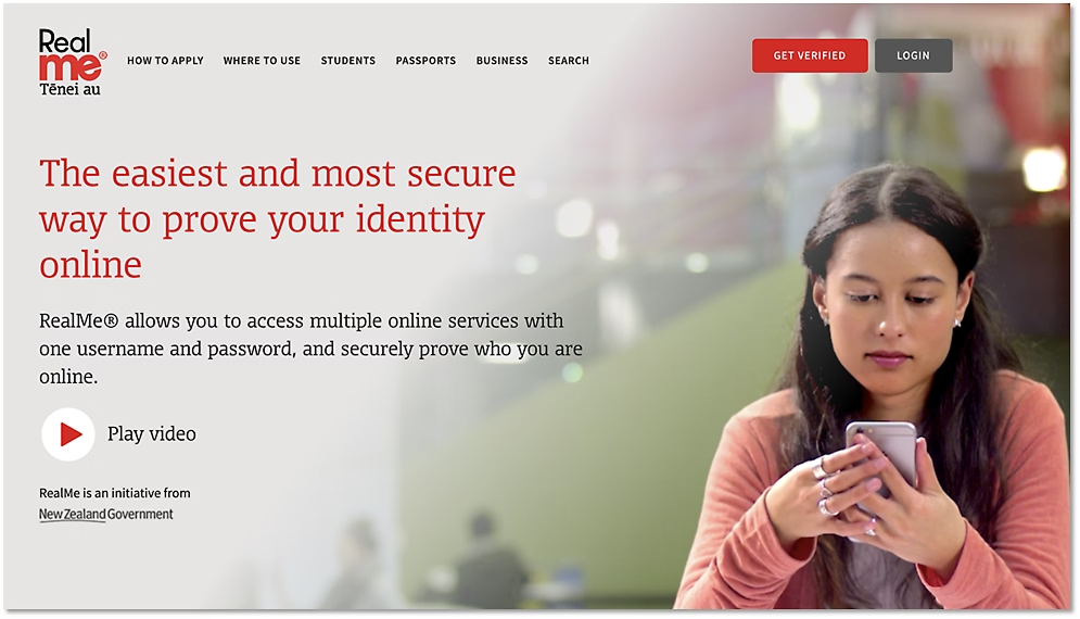
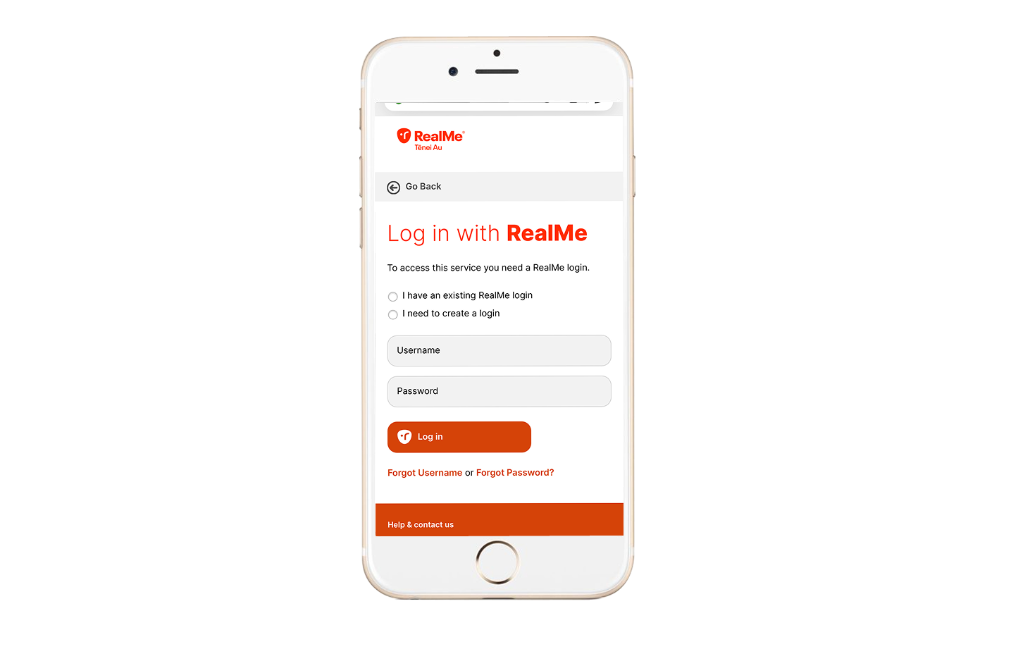
RealMe is New Zealand’s national digital identity platform, enabling citizens to verify their identity online for secure access to government and private sector services.
The existing verification experience was inconsistent across web and mobile, leading to user confusion, incomplete registrations, and support requests. The challenge was to design a unified verification flow that balanced strict security requirements with ease of use and accessibility — particularly for first-time users and those less familiar with digital identity concepts.
Process Workflow
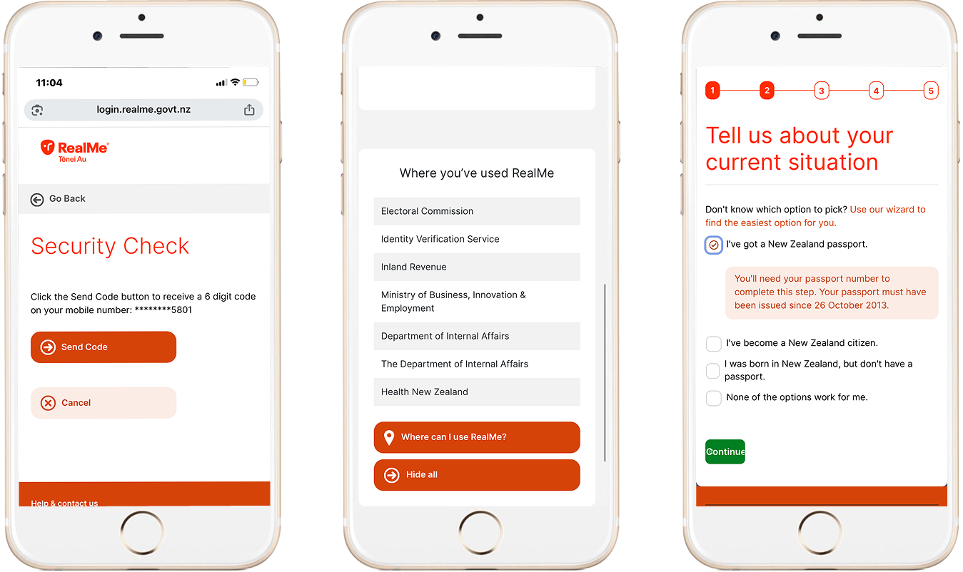
I worked with the product team, service designers, and developers to map the complete identity-verification journey — from document upload and biometric validation through to account activation and third-party authentication.
Through a series of workshops and journey-mapping sessions, we identified key friction points in user comprehension and task flow. Using wireframes and interactive prototypes, I tested language, hierarchy, and visual cues to improve task clarity. Accessibility and inclusivity guided every iteration, ensuring the process worked seamlessly across devices and user abilities.
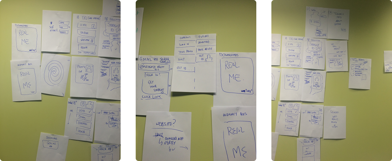
Early discovery workshop exploring user pain points and opportunities in the RealMe verification process. Sticky-note synthesis helped the team map user emotions, accessibility barriers, and technical constraints before moving into structured journey mapping.
Click image to open/close
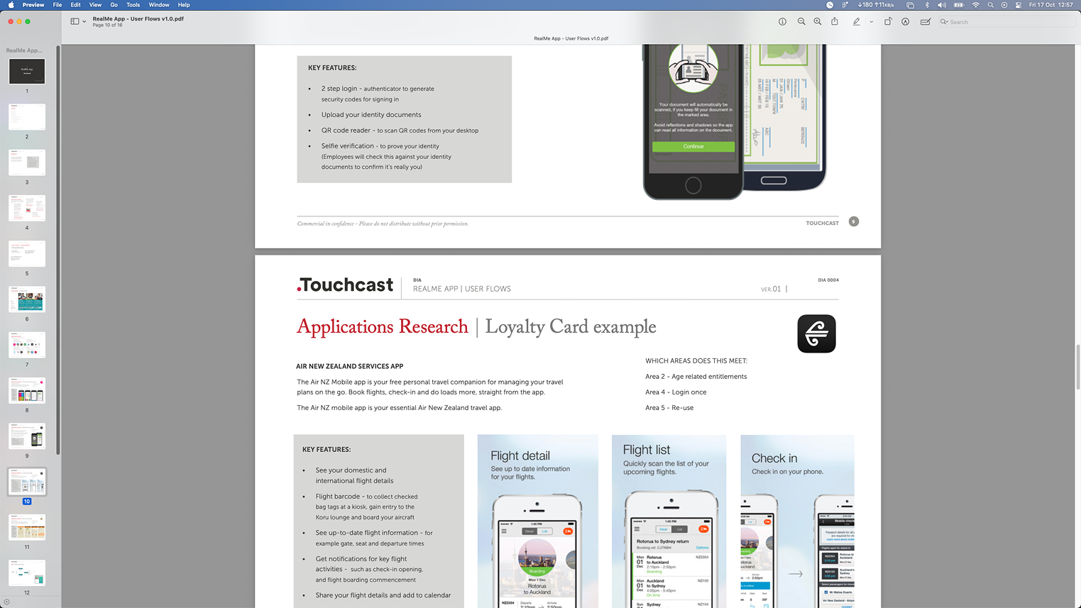
Page from a comparative research report analysing loyalty and ID verification apps currently in market. The review identified common trust patterns, onboarding flows, and visual conventions that informed RealMe’s design strategy and usability principles
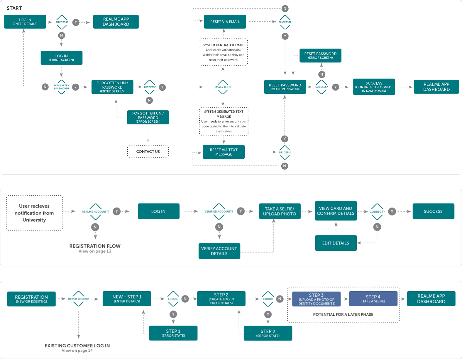
User journey flow charts mapping the end-to-end sign-up process for a university student verifying their identity through RealMe. This visualisation helped identify friction points, clarify decision paths, and align technical and design teams around a unified experience.
Final Design
The final design introduced a clear, step-by-step verification process with transparent progress indicators, simplified document instructions, and real-time feedback for errors. Mobile camera integration was streamlined to guide users through capturing valid ID and face-match photos without breaking flow.
Consistent typography, iconography, and visual cues reinforced trust and readability, while modular components ensured scalability across other RealMe services. The new design system also supported adaptive layouts, improving usability across screen sizes and connection speeds.
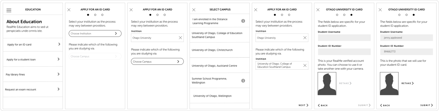
Detail of the processs flow for a student to apply for a student ID card. This was used to generate the low-fi prototype for user validation and language refinement in one to one interviews.
Click image to open/close
Complete prototype wireframes mapping the student ID application flow. The prototype was tested to confirm that navigation, task order, and feedback cues supported an intuitive, frictionless user experience.
Impact
The redesigned verification experience reduced drop-off rates during the photo ID and biometric verification steps by an estimated 30%. Early testing with diverse user groups showed increased task completion confidence and higher satisfaction with clarity and tone of communication.
Beyond usability gains, the new design strengthened public trust in digital identity by making a complex, high-security process feel transparent, human, and approachable — setting a new standard for user-centered design in government digital services. View the initial prototype for University ID card here here.
Reserve Bank of Australia
Improving accessibility, usability and communication for Australia’s central bank website.
Problem Context
The Reserve Bank of Australia (RBA) wanted to ensure its flagship website, rba.gov.au, reflected its public responsibility to be accessible, transparent, and informative for all Australians. The existing site had evolved over many years, leading to complex navigation, inconsistent content hierarchy, and barriers for users with accessibility needs such as low vision or screen reader dependency.
The challenge was to understand how diverse audiences — from economists and analysts to journalists, educators, and the general public — discover, interpret, and act on economic information. Our task was to develop a research strategy that identified usability pain points and provided evidence-based recommendations for improving accessibility, structure, and communication across the site.
Click image to open/close
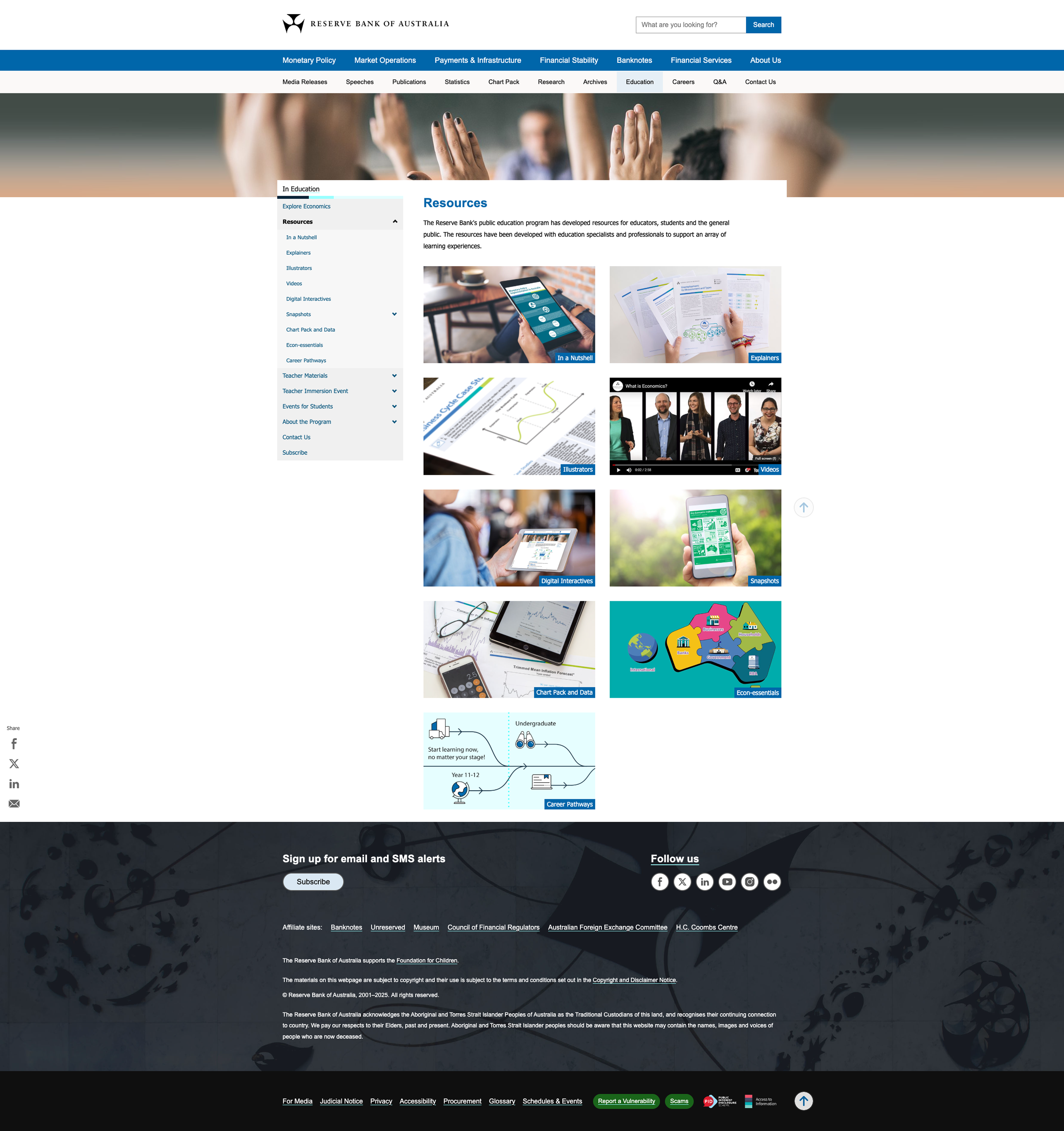
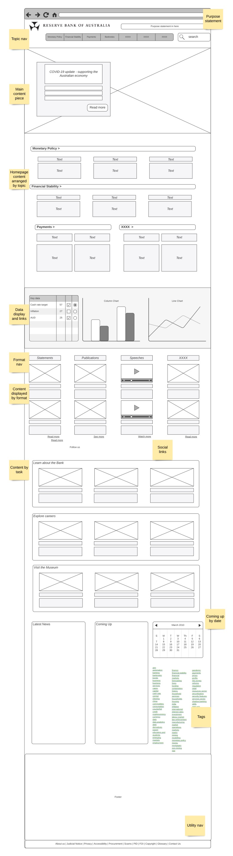
Page from the redesigned RBA website showing the new global navigation, side accordion menu, improved content hierarchy, and restructured footer. Each element was informed by user research and accessibility testing to improve clarity, discoverability, and ease of navigation.
Workflow
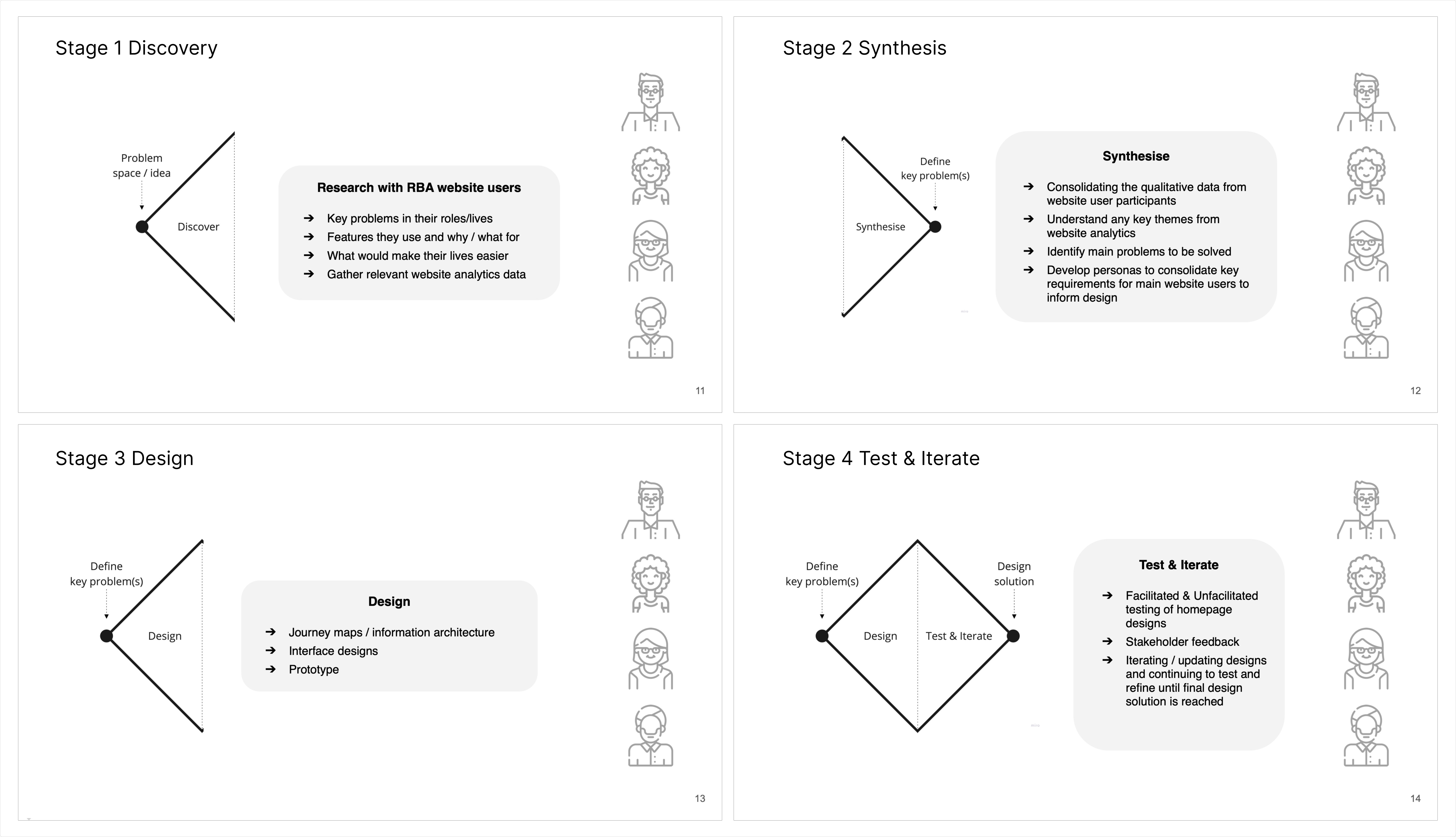
Working in partnership with research firm Aylmer Anderson, I helped lead the design and execution of a comprehensive UX research framework structured into four stages: Discovery, Synthesis, Design, and Testing.
During the Discovery phase, we conducted stakeholder interviews, heuristic reviews, and accessibility audits to map the current experience. We defined a statistically representative spread of users, ensuring balanced participation from key groups including individuals with low vision and assistive technology users.
In the Synthesis phase, we organised qualitative insights and quantitative data into actionable themes around content comprehension, navigational behaviour, and accessibility friction. These insights informed a design strategy that guided subsequent prototyping, testing, and iteration.
Overview of the four-phase design strategy: Discovery, Synthesis, Design, Test & Iterate. The framework aligned researchers, designers, and stakeholders around a shared process for transforming user insights into accessible, evidence-based design outcomes.
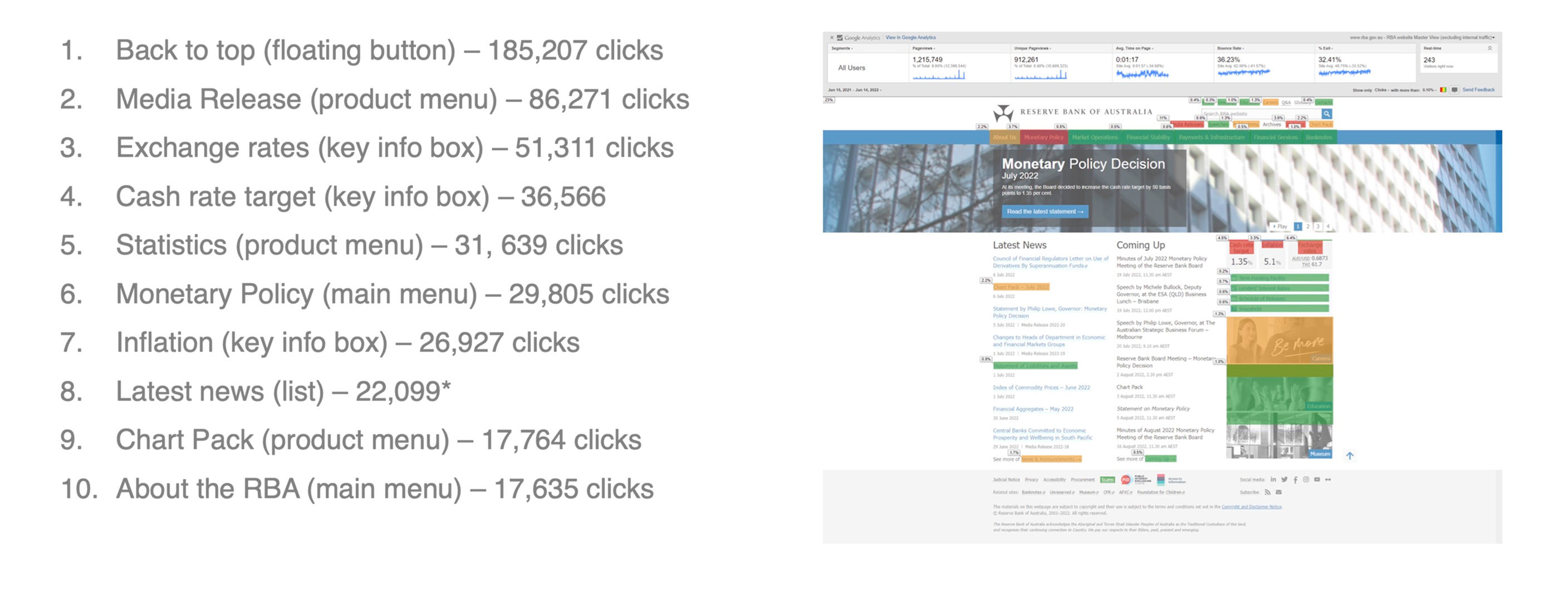
User interaction heat map from the legacy RBA homepage highlighting click density across key elements. Findings from this analysis informed navigation restructuring and content hierarchy improvements in the redesigned site.
Click image to open/close
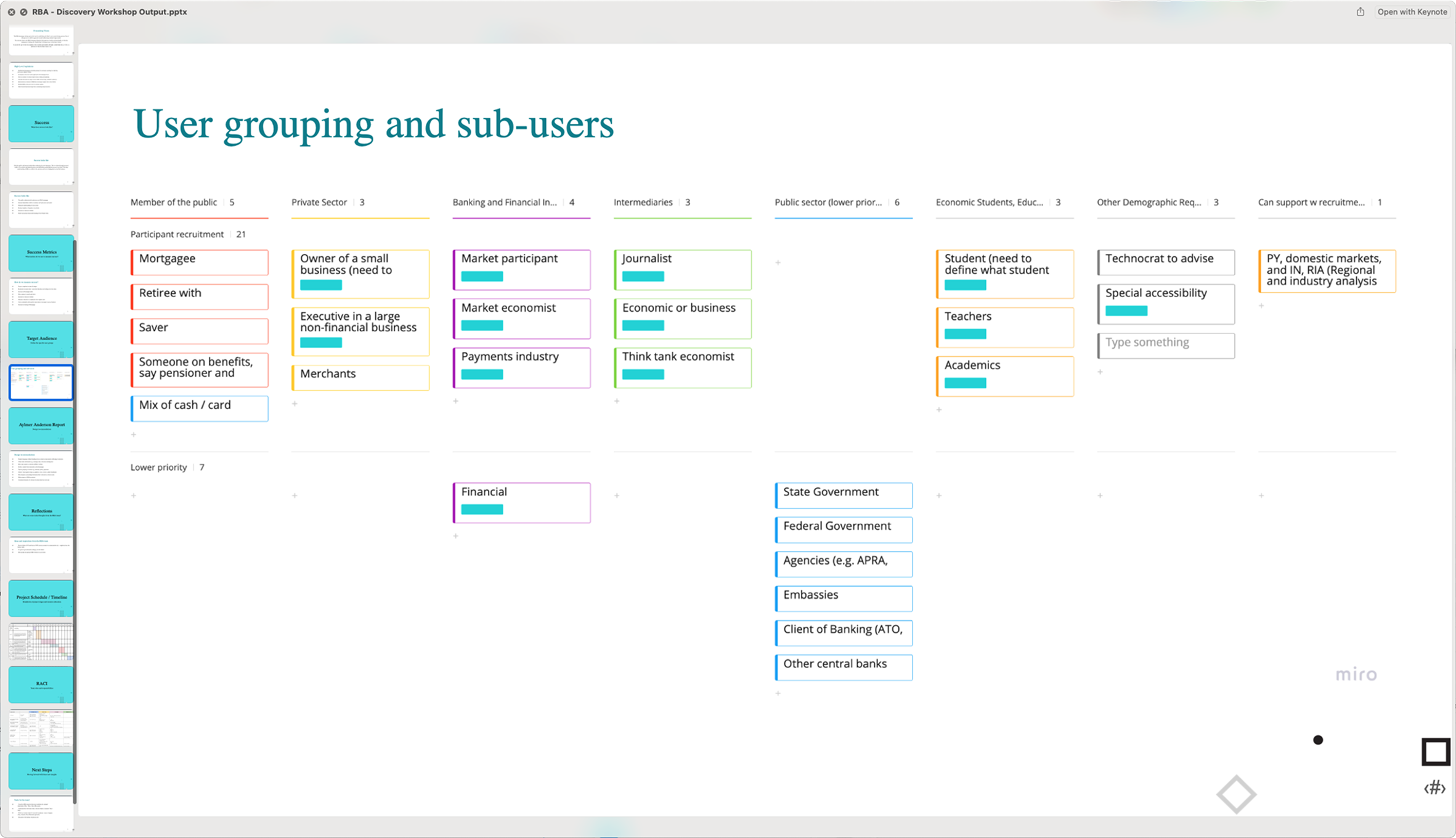
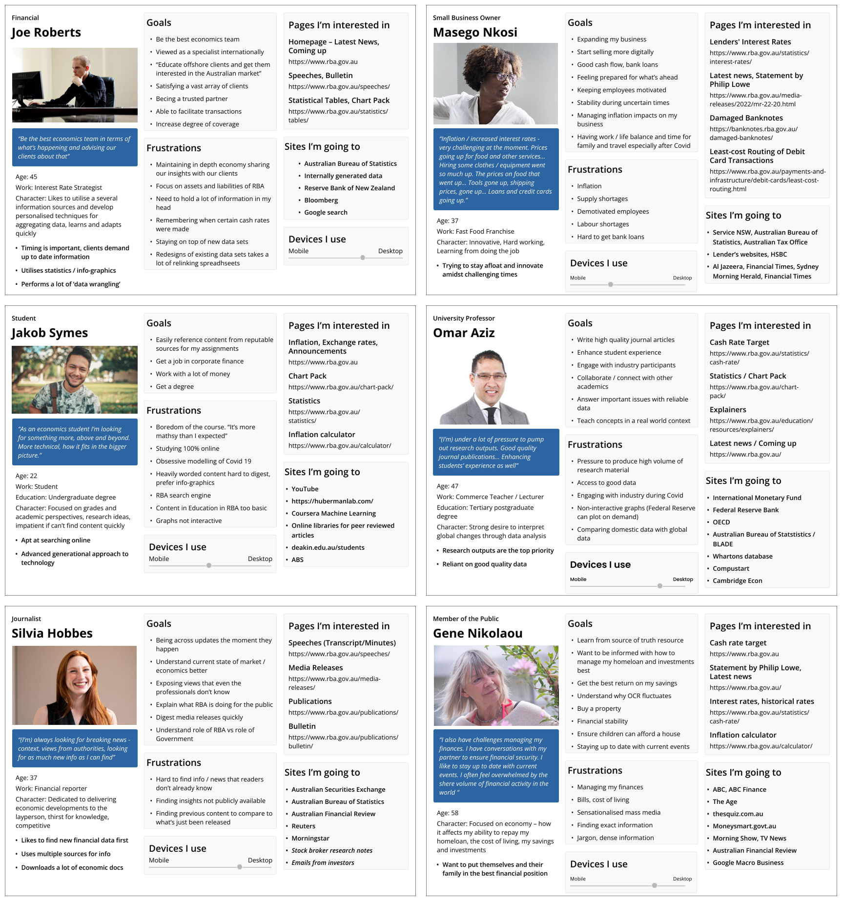
Excerpt from the Discovery phase documentation identifying key user groups and sub-segments. This framework informed participant recruitment and ensured the research captured balanced perspectives across professional, educational, and general public audiences.
Click image to open/close
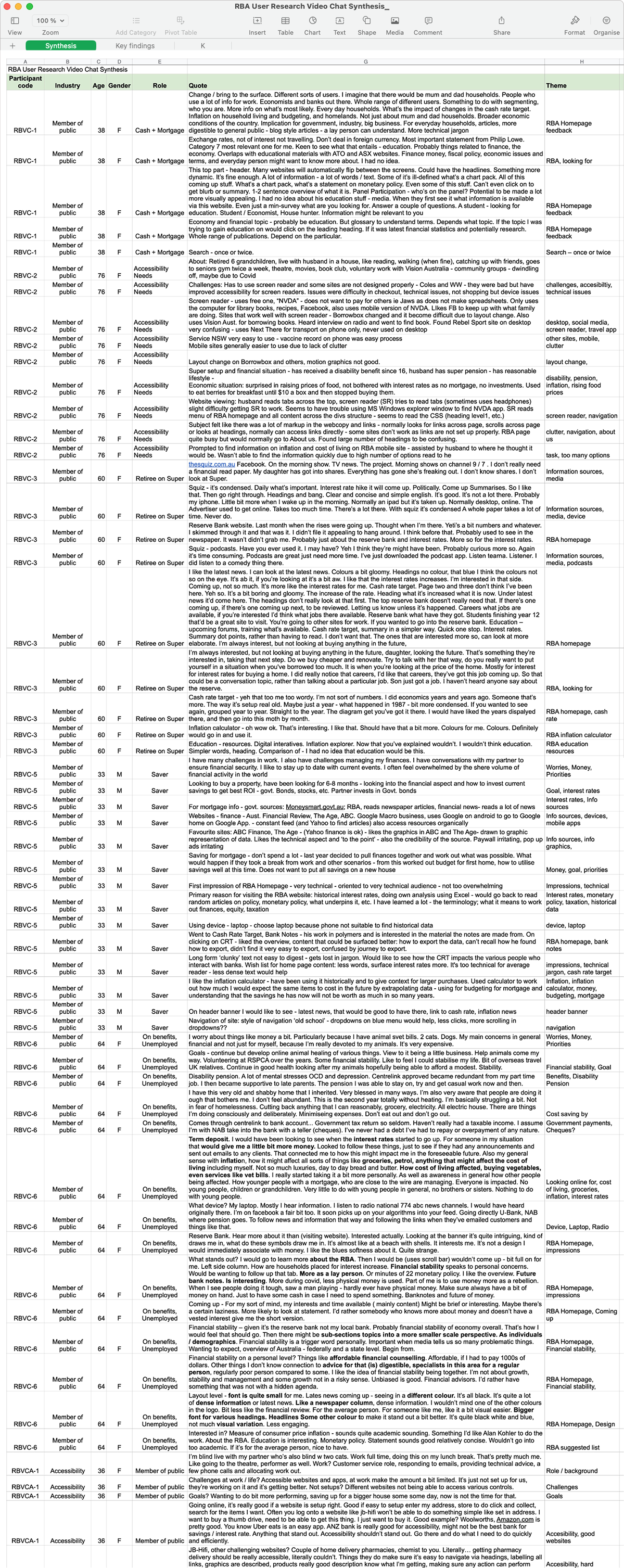
Excerpt from the user research synthesis summarising findings from video interviews. The table captures recurring themes, user behaviours, and accessibility challenges that informed the design recommendations for rba.gov.au.
Click image to open/close
Personas generated from the synthesis phase, translating research findings into relatable user archetypes. These profiles helped the team maintain empathy and design focus across diverse audiences, from analysts and educators to everyday users.
Final Design
Based on our findings, the design recommendations focused on creating a more intuitive information architecture, improving content readability, and embedding accessibility standards at every level of design and development. We proposed a clearer visual hierarchy for data-heavy pages, consistent interaction patterns across content types, and improved alt-text and keyboard navigation support for assistive users.
The team’s iterative design process involved prototyping improved navigation models and testing them with a diverse mix of participants to validate clarity and comprehension. Each recommendation was backed by user evidence, ensuring design changes aligned with measurable accessibility and usability outcomes.
Click image to open/close
Initial homepage wireframe created at the start of the prototyping phase. The layout tested new content hierarchy, navigation pathways, and accessibility improvements identified during the research stages, forming the foundation for user testing and iteration.
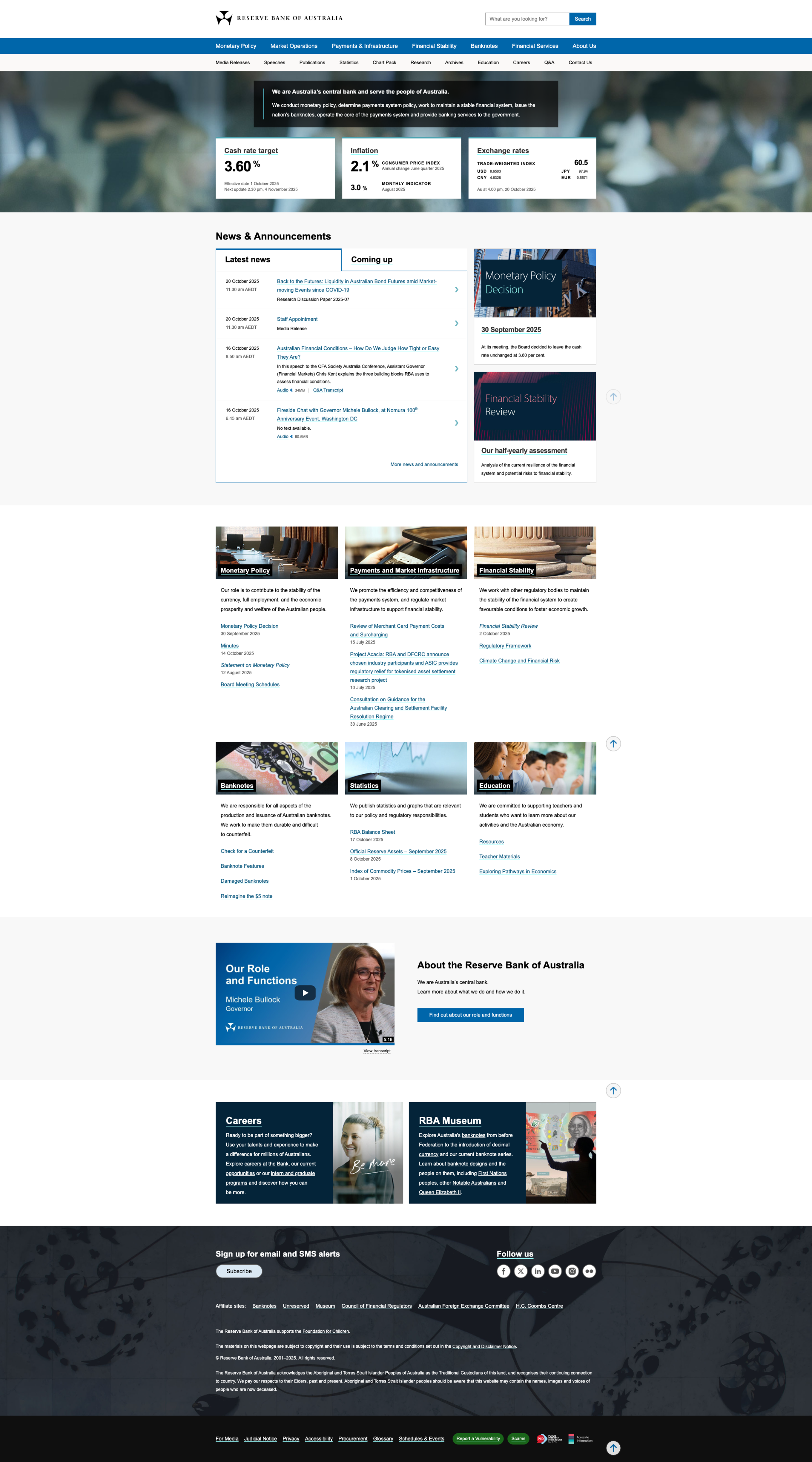
Example of the redesigned RBA website incorporating recommendations from the research project. The improvements in hierarchy, navigation, and accessibility demonstrate how evidence-based UX design translated into tangible user and organisational benefits.
Impact
The research outcomes and design recommendations provided the RBA with a clear roadmap for modernising rba.gov.au while meeting WCAG 2.1 accessibility standards. By grounding every recommendation in user evidence, the project helped the Bank prioritise changes that had the greatest impact on inclusivity and comprehension.
The collaboration between the RBA, Aylmer Anderson, and our design team strengthened the organisation’s understanding of its diverse audiences and set a foundation for ongoing, user-centred digital transformation. The project demonstrated how thoughtful UX research can translate institutional complexity into clarity, transparency, and trust.


