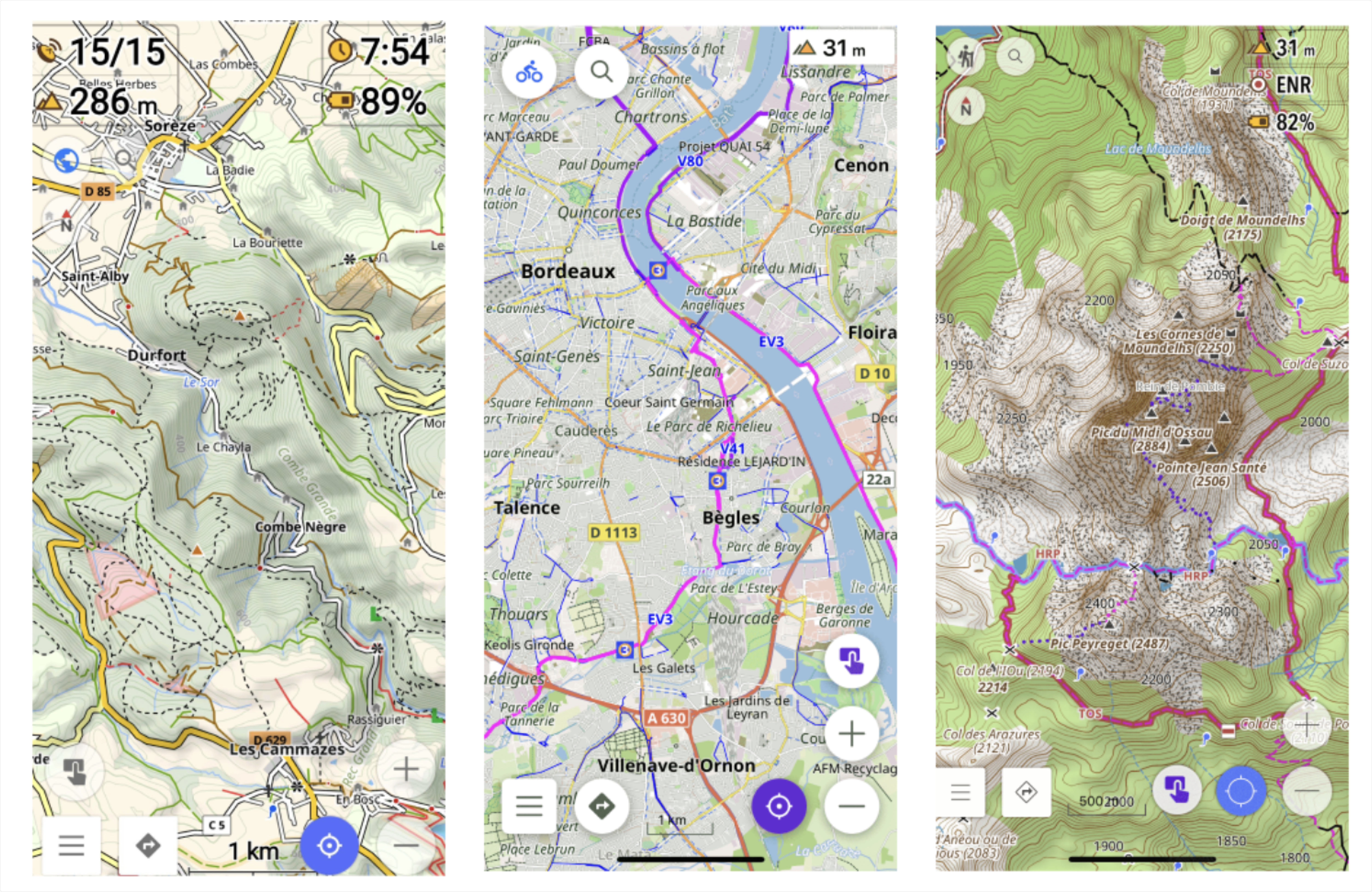
www.osmand.net
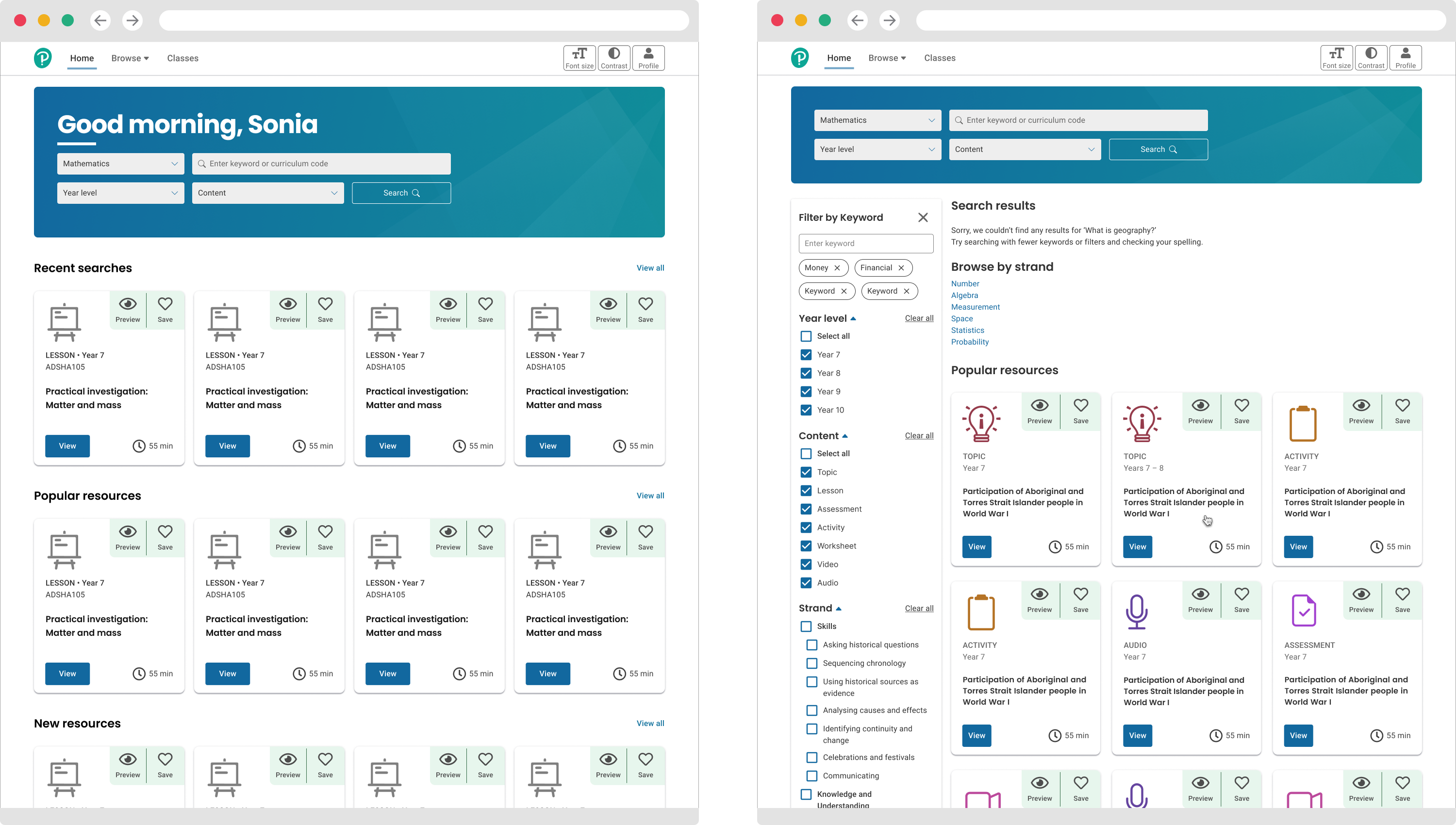
The Brief
For the lanch of the iOS version of the OsmAnd app the developers wanted to rethink the UX paradigm. New functionality was to be introduced and this required research into how iPhone users will engage with the application in iOS. An app-wide review of the functionality of the current Andriod app was needed. To do this we grouped the most-used functions into epics and wireframed the user stories that sit under these epics. Two main features were the initial focus of the UX design process - Compass and My Location. To implement improvements and introduce new functionality based on user feedback for these two epics we refined user group definitions and identifed critical paths in user journeys.
My Approach
The scope of work was split into two stages:
1. Defining the high-level functional grouping and the semantics behind the grouping
2. Defining the user pathways to access the functionality in Compass and My Location
First stage: Defining the high-level functional grouping.
This stage delivered a series of epics, each containing a number of sub-functions that compile to form a high level function like 'Navigation'. The basic interactions were outlined, such as how to download new maps, access the settings, etc.
The HUD (heads up display) was discussed, this was an ongoing discussion as the items to be included in the top level of the HUD are crucial. In the present configuration, the HUD often has items that can be accessed from elsewhere, making it confusing for the user as this could be interpreted to mean that there are two different UX paths whereas in fact the path is the same.
Therefore my remit was to develop design solutions to these potentially confusing issues, identify the best user pathways for accessing this functionality and completing a certain task, then design graphical representation of these pathways.
Second stage: Defining the user pathways for epics Compass and My Location in iOS
From user research data we identified that the two most important epics in order of frequency of use and utility to the user were Compass and My Location.
We defined these epics in terms of why they are important to the user at this level and how the iOS hardware and system impacts on the UX design.
Then the stories that make up the epics were discussed in turn and the way UX will answer the issues was outlined.
Finally the various potential user journeys were mapped out and graphical representations of the journeys produced.
User Stories
We identified four main user groups:
• Navigators
• Map Readers
• GPX Readers
• OSM Editors
asdfasdasdasdasd With the production team I participated in discovery workshops to identify stakeholder ambitions, define responsibilities and comms inclusion, mandatory functionality vs 'nice to haves' and key business objectives. We gathered and analysed user data on secondary school teachers' requirements and desires around in-market LMS platforms.
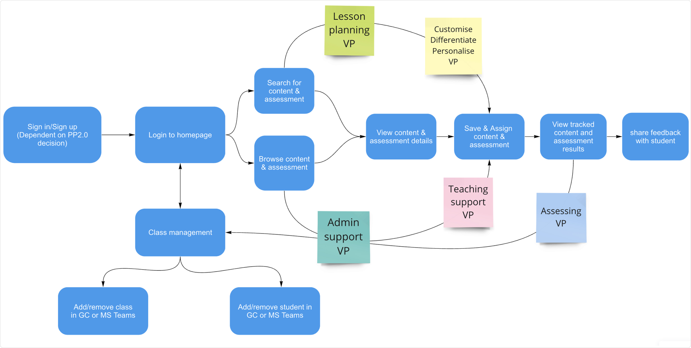
The Process
With the production team I participated in discovery workshops to identify stakeholder ambitions, define responsibilities and comms inclusion, mandatory functionality vs 'nice to haves' and key business objectives. We gathered and analysed user data on secondary school teachers' requirements and desires around in-market LMS platforms.
Kick off discovery notes for high-level admin requirements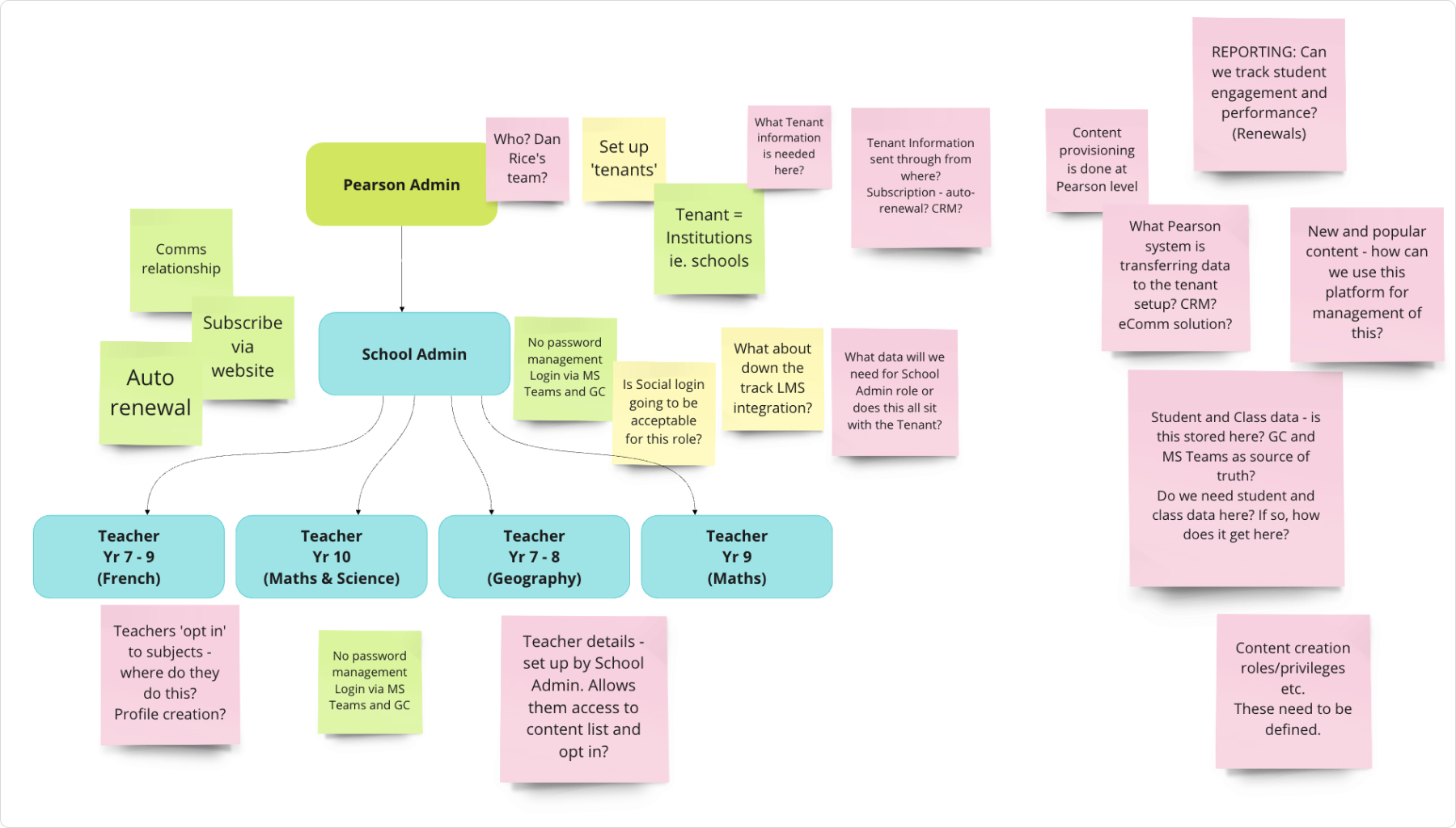
Design Challenges
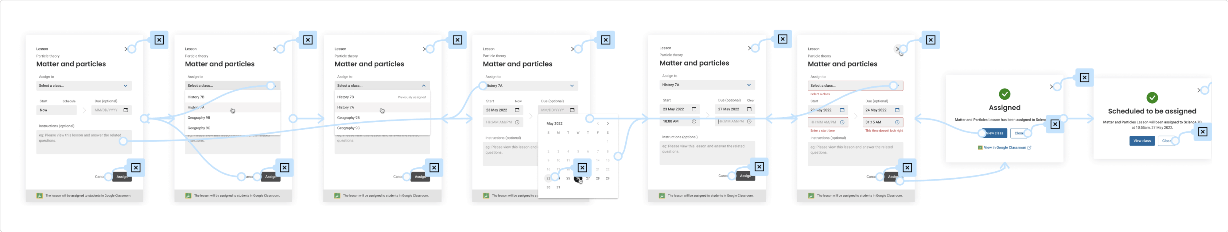
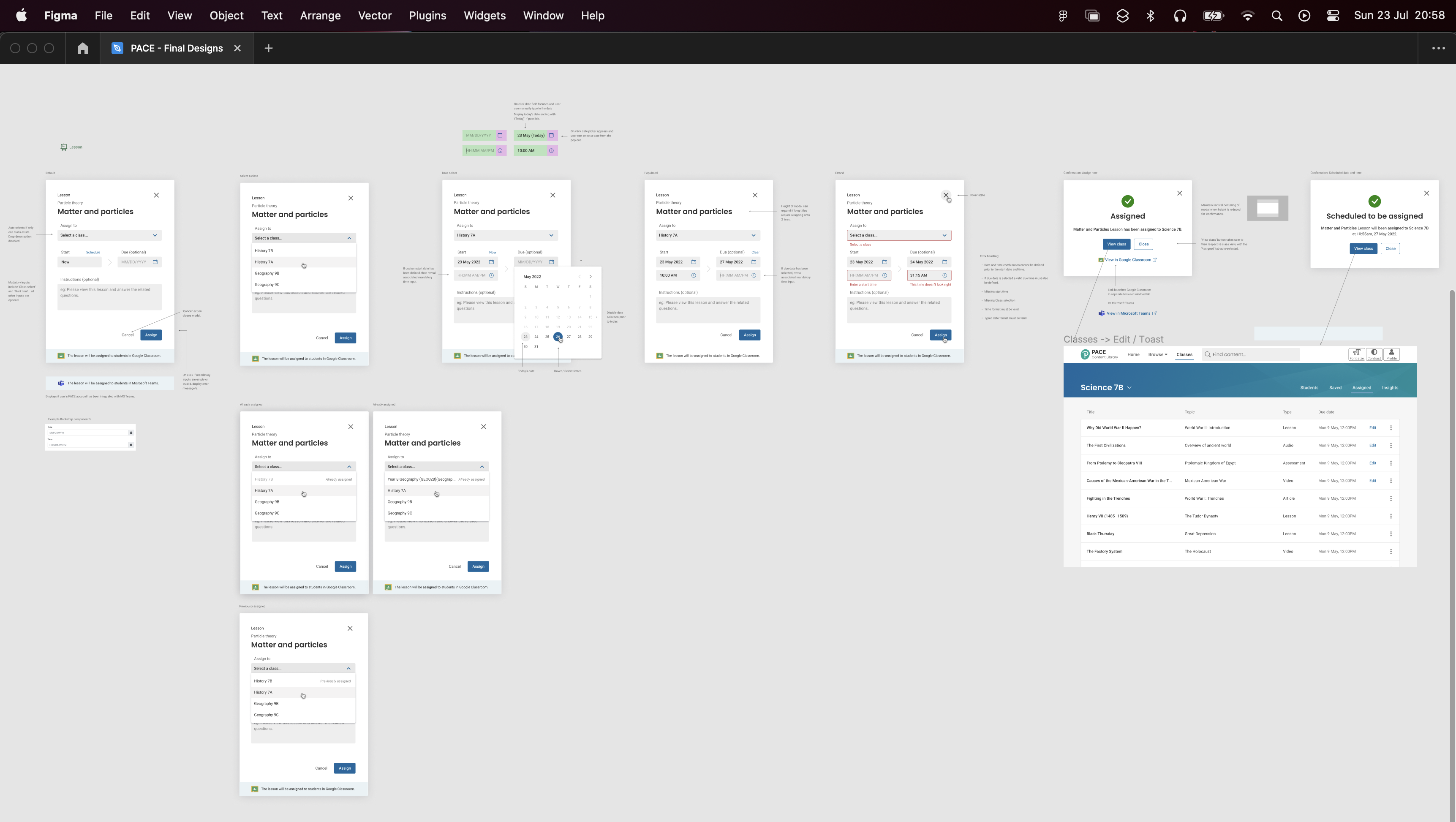
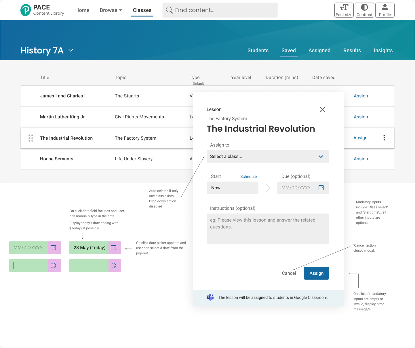
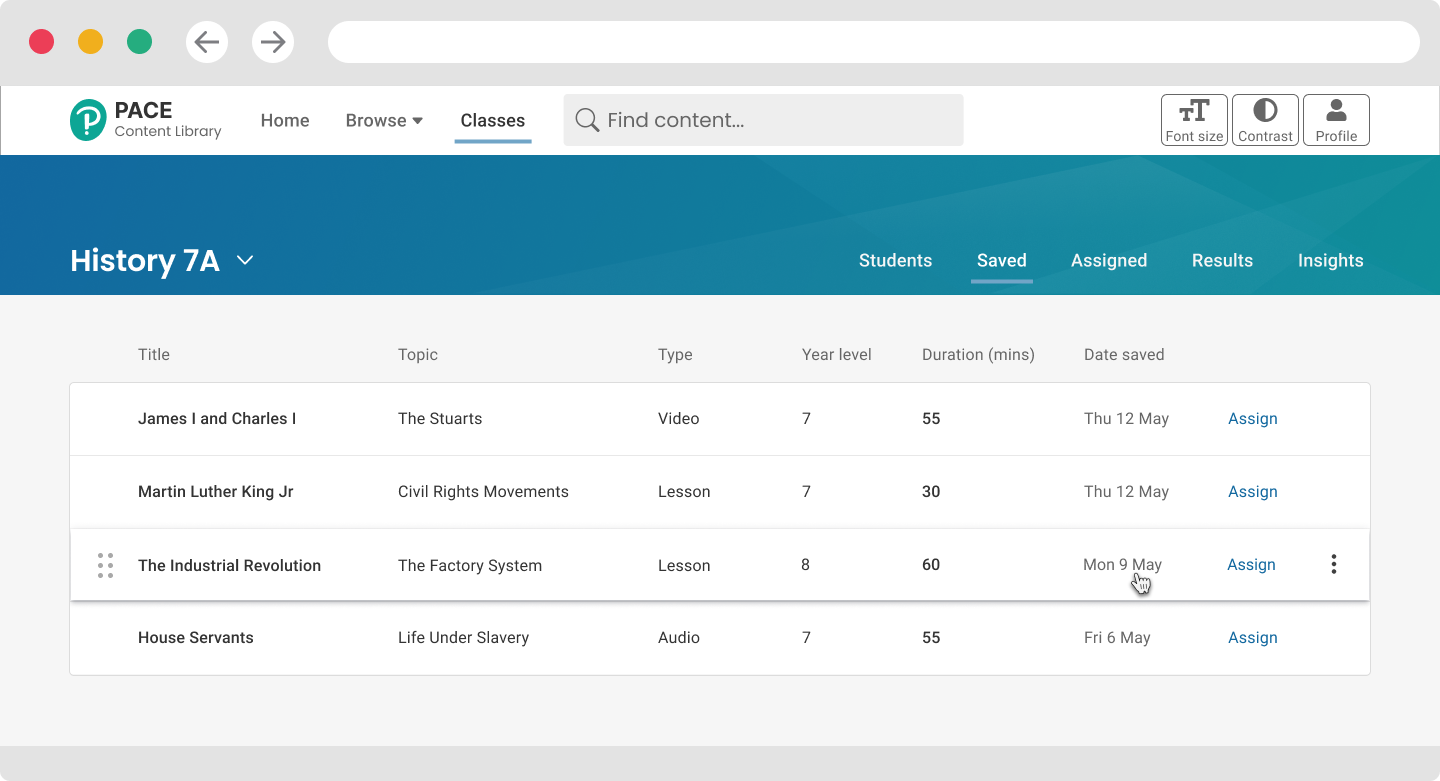
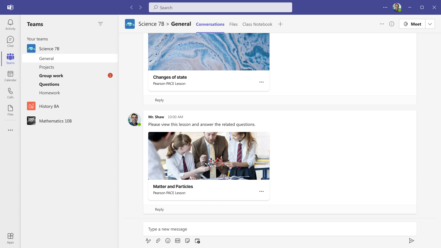
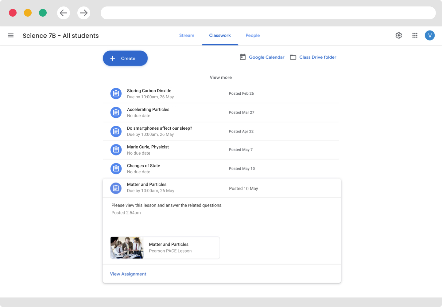
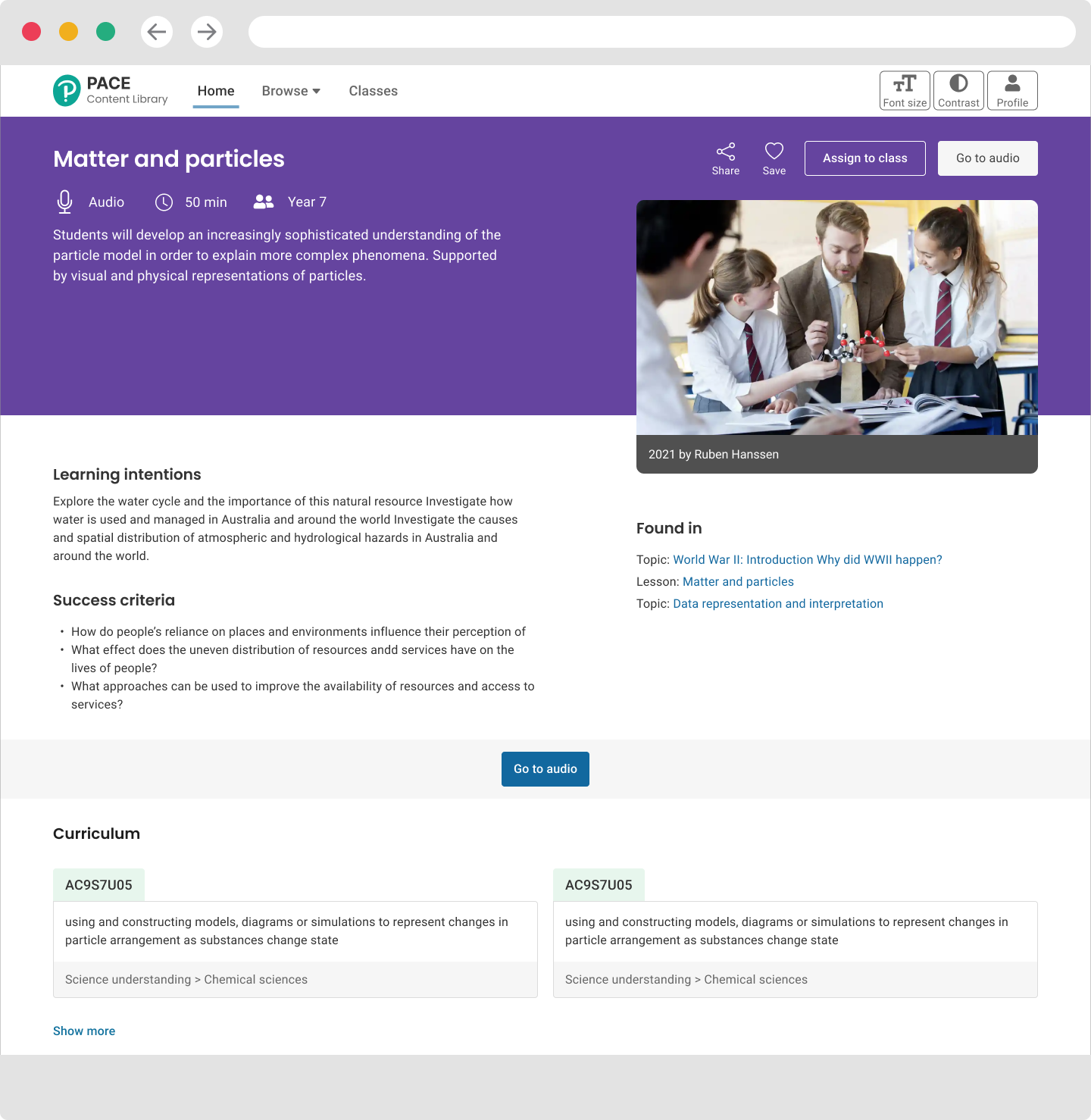
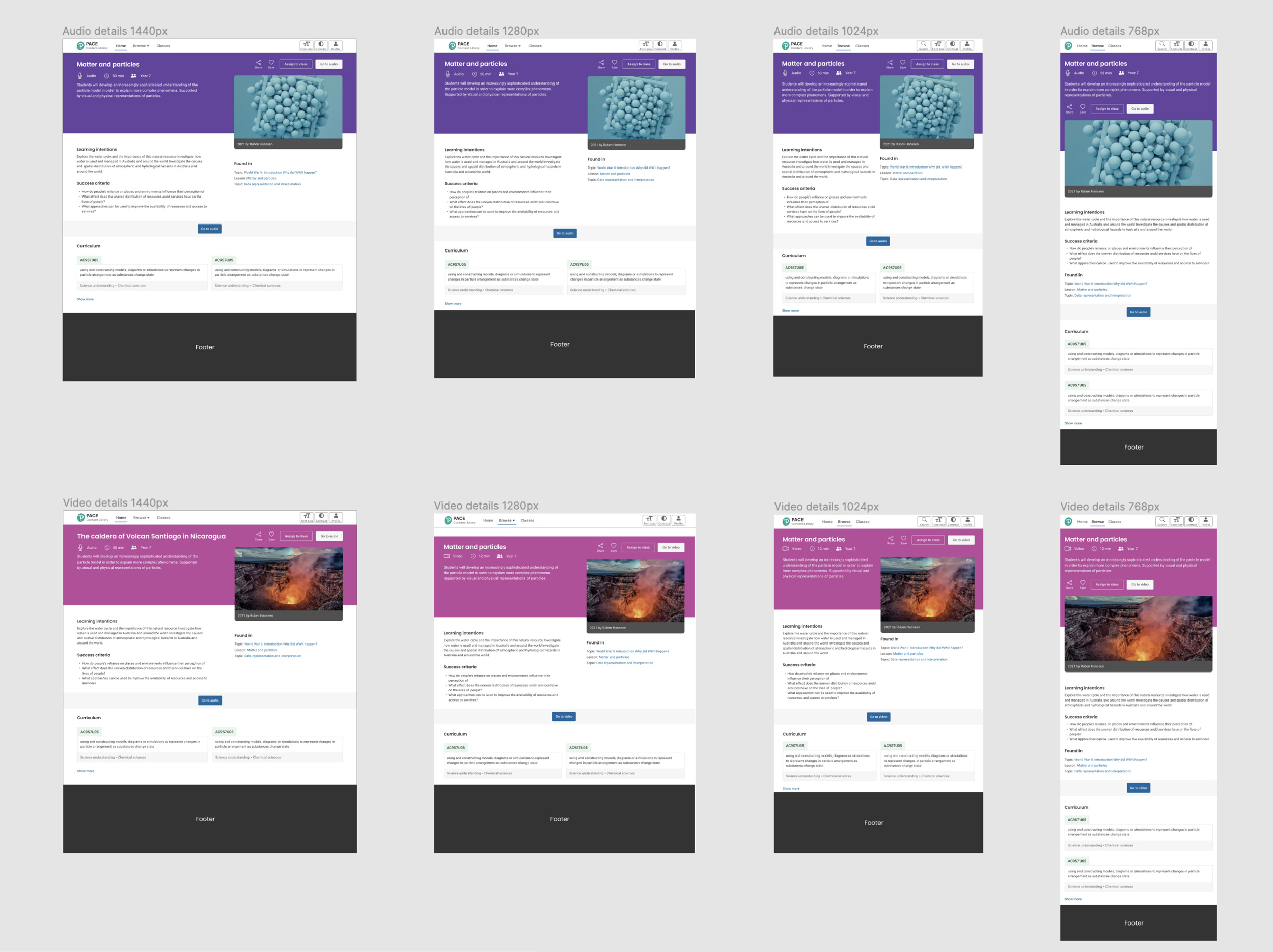
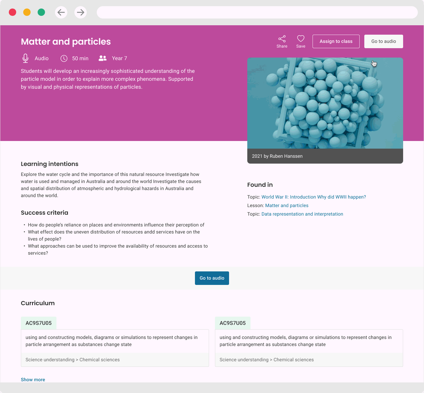
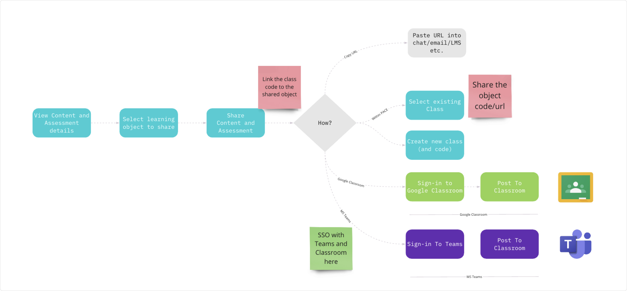
The design strategy needed to pull focus on how secondary school teachers build classes and courses in Microsoft Teams or Google Classroom. Assigning a digital asset to the teacher's current Teams or Classroom social account had to be simple and sensitive to privacy and data security. By wireframing and simulating the process we were able to design a UI that was intuitive and engaging but also made the job easy for the engineers to write the API calls for both platforms with the same UX.
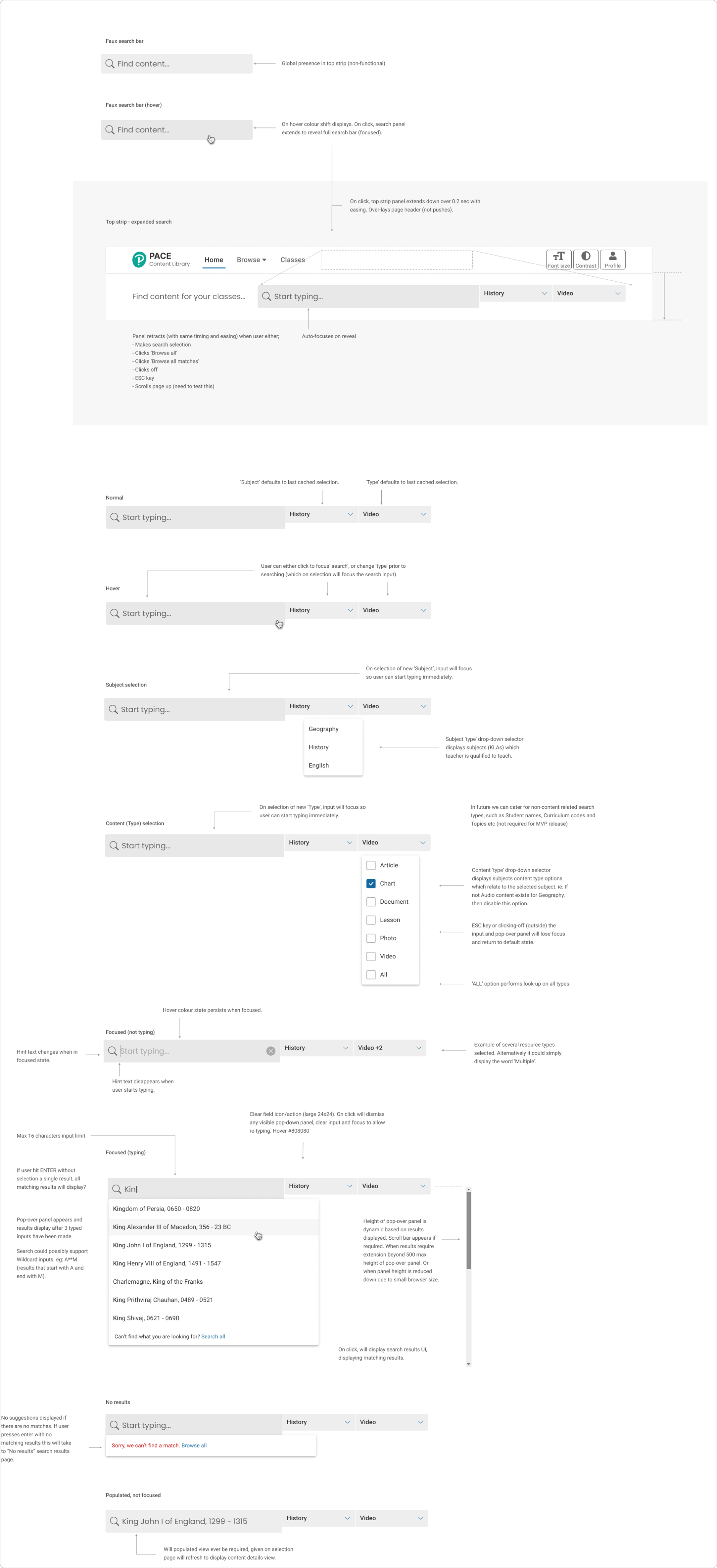
Modal wireframe for assigning an asset to a class